|
|
|
Showing 231 - 240 of ~670 |
| Image |
Comment |
| 02/01/2010 01:00:50 PM | Window Boxby tembaComment: Hi Jane, greetings from the Critique Club!
I must say that this photo is original like I haven't seen in a while now.
You demonstrate great photographic eye, and a terrific sense of composition.
Lighting
Even throughout the whole picture, a little darker at the bottom, but nothing considerably.
Tones
The yellow just shouts at you: "I'm here!", it is greatly balanced with the wall and the flowers.
Saturated just enough.
Composition
What is there to be said? Perfect framing, the slope on the windowsill makes the viewer come back again and again to the spot.
Great balance between the low green's and the negative space on the top.
Processing
Great texture on the wall, I would have brightened a bit more the lower are. so that people can also divert their attention to that spot.
Overall, it's a great photo, that scored almost a 6.
Probably people where more into bolder shots, landscapes, etc, and the simpler yet effective look of this photo didn't appeal much.
You did a good job, and this one's a keeper.
If you have any questions feel free to contact me.
Regards,
Joao
|  Photographer found comment helpful. Photographer found comment helpful. |
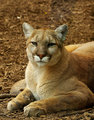
| 02/01/2010 12:10:27 PM | The Stareby bs-photosComment: Hi Brandi, greetings from the Critique Club!
First reaction I had when I saw your photo was: "Wow, there's so much details on the fur, it's amazing!"
It's a shame that it place here it did, but anyway it was a 5.78 score, not too bad.
Lighting
Great use of natural lighting, the shadows are not distractive, and the subject is very well lit.
Composition
Although a crop at the top would bring the feline into a more central position, it would make it a square crop, and it might be too tight, I do think that you choose correctly in this manner.
Processing
As said already below, since it was an advanced edit challenge, some brightening / dodging could have been used on the eyes / face to make it a little bolder.
The sharpening is amazing and it's what really brings out the picture.
The problem with this scene is that you don't have that much contrast between the puma and the background; one choice could have been to slightly desaturate the background, so the subject would stand out more. Also lighting up the puma would detach it from the bg pretty well.
Overall, it's a photo that really makes an impression, and at 1/60 you had a very steady hand (or a very sturdy tripod :)
If you have any questions feel free to contact me.
Regards,
Joao
| | Photographer found comment helpful. |
| 02/01/2010 06:46:39 AM | Left for deadby RuneberComment: Hi Rune, greetings from the Critique Club!
Thank you for participating in the Best of 2009 challenge.
First of all, don't be disencouraged by your placing, you still received a 5,5 in a photo, and this challenge had a lot of good photos to look at.
Regarding your photo:
Lighting
The most well processed parts of this picture are the sky and the truck. They have been very improved by the HDR treatment.
The mixture between yellow of the sky and blue of the truck make for a pleasing balance.
The rest of the picture is a bit dark, and probably some users had problems with some displays, some notebooks do display it very dark, and it could have worked against you.
Composition
There's one thing that probably kept your shot from scoring higher, and that is the branches in front.
I'm not a supporter of damaging the scene when you shoot, but by the looks of the surroundings if you would have taken out the branches in front, the truck would be clearly visible, making it the central point. This way, it's just something more in the landscape. Also, a shot from a lower perspective could have got you more sky, it's very beautiful. Still, the overall composition is correct.
Processing
As said before, a bit brighter would have made it more acessible to most users. Anyway, good exposure at Photomatix.
If you have any questions feel free to contact me.
Regards,
Joao
| | Photographer found comment helpful. |
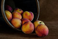
| 02/01/2010 06:30:57 AM | Still life with peachesby vawendyComment: Hi Wendy, greetings from our Critique Club! :)
First of all, I think you did a great job with the processing, it's the thing that I notice more than anything.
Lighting
It's just perfect the way the inside of the bowl slips gently into shadow, so very smoothly. Also, the left side is dark, to add to the dynamic of the scene. Also, the ISO 1600 might have been too much, you could probably use a tripod, bump that aperture to f/13ish with a lower shutter speed.
Composition
A little more space at the bottom would helped the shot, as with the focus on the front element. It could use just a little more clarity.
Pros - the way the peaches fall from the bowl is very smooth and clean, it's really a perfect composition.
Also the seamless background is so wonderfully textured, and it fades out very nicely.
Processing
You were able to succeed in recreating the look you wanted. The photo looks like a painting and has very rich earthy tones. It has a lot of grain, but it just adds to the overall look.
Still, it was a 6+ score, and it's a very good picture.
If you have any questions feel free to contact me.
Regards,
Joao
| | Photographer found comment helpful. |
| 02/01/2010 06:00:40 AM | Help yourselfby snafflesComment: Hi Susan, greetings from the Critique Club!
Lighting
Regarding this picture of still life, it's notorious that you took some time to setup everything, and you've been very careful with the lighting and positioning.
This works for this shot, as the light is very even and balanced, without blown highlights and shadows. The only weak point are the shadows in front left, because of the bouncing on the ceiling / wall.
Composition
My favourite part about this composition is how you placed the pineapple, the grapes and the big grapefruit(?) in front. The fact that the grapes fall onto the table gives a very pleasing dynamic.
As for the cons, the remainder of the fruits are very piled up, like they were put in the back, without specific placement. This and the slight tilt of the table are in my opinion the things that people noticed unconsciously.
Processing
No problems here, it was nicely processed, maybe it could use just a tad more contrast and brightness, but it didn't harm your entry.
If you have any questions feel free to contact me.
Regards,
Joao | | Photographer found comment helpful. |
| 02/01/2010 05:43:23 AM | - salto del laja -by robeComment: ?Hola Roberto, que tal? :)
Greetings from the Critique Club!
Regarding your photo, it is important that you realize that the score does not always reflect the quality of the picture. Having said that:
The scene
Very appealing in it's whole, the composition is very good. The slight tilt is not very usual in landscapes, but it might have worked to your advantage. It gives a sense of water flow to the right of the picture.
Processing
Looking at your original, you managed to process it very well. It is definitely not eye candy, and probably that's why it placed where it did.
The high vignetting in the original, plus the post processing of the shot make it look like a pinhole camera shot. If it was the intention, you succeeded brilliantly!
The sepia tones make it very vintage, postcard like.
It is indeed dark, and in some computer screens it would be too dark for someone to distinguish the features, but the style you chose was that in fact.
The border was a good choice, it does not detract from the picture.
If you have any questions feel free to contact me.
Regards,
Joao | | Photographer found comment helpful. |
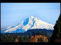
| 01/30/2010 12:34:25 PM | Mt Hoodby Reedman18Comment: Hi Steve, greetings from the Critique club!
First gut feeling:
The image seems to have an obtrusive element, that somehow gets in the way.
The scene is great, the levels of contrast from the closest plane to the mountain are very appealing, and the definition is very good, the focus is spot on.
Unfortunately, the tree on the leftright removes the notion that people associate with landscape to resemble a bit more like a window shot. The tree frames this shot, whereas one would like to have had a clear vision.
The border is a good idea, although if it was even the effect would be stronger.
For post processing, your tones are great, and you just need to remove the blue cast from the mountain. On way is to desaturate slightly the cyans and blues. You'll loose blue in the sky as well, but since it's advance editing you could mask it out.
Although it placed where it did, a 5,3 score is good, since this is not a comparative score, but an absolute.
Feel free to contact me if you have any questions.
Cheers,
Joao Message edited by author 2010-02-01 04:09:24. |
| 01/28/2010 11:27:20 AM | Shhht, I'm still asleep...by GiorgioBaruffiComment: It's amazing the amount of details that you provided in this one. The 800px size does not do this photo any justice, it has so much more details, it's unbelievable. | | Photographer found comment helpful. |
| 01/28/2010 11:26:23 AM | "Hindsight"by RmacComment: It's just so...so...fairy-like, peaceful, beautiful....
Great work on processing this shot, it actually conveys calmness, serenity. | | Photographer found comment helpful. |
| 01/28/2010 11:25:04 AM | Obstinate Graspby androgeusComment: Story is: I use sometimes my notebook connected to my 32" LCD TV, and when this photo appears it's just so SHARP!! Amazing tones and great bokeh.
Congrats! | | Photographer found comment helpful. |
|
Showing 231 - 240 of ~670 |
Home -
Challenges -
Community -
League -
Photos -
Cameras -
Lenses -
Learn -
Help -
Terms of Use -
Privacy -
Top ^
DPChallenge, and website content and design, Copyright © 2001-2025 Challenging Technologies, LLC.
All digital photo copyrights belong to the photographers and may not be used without permission.
Current Server Time: 08/20/2025 06:52:02 AM EDT.
|