| Image |
Comment |
| 09/14/2010 12:04:24 PM |
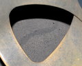
Well being triangleby andycreerComment: I think that to pull of a homemade shot it has to be a very good one, and this looks a bit amateur, mostly because of the dust on the table and the duotone table. |
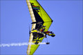
| 09/14/2010 11:59:17 AM |
Fly Angleby HarveyGComment: The crop is too tight, you cut the top and bottom parts of the glider, and the subject is not very interesting. |
 Photographer found comment helpful. Photographer found comment helpful. |
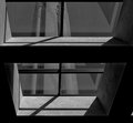
| 09/14/2010 11:56:22 AM |
|
| Photographer found comment helpful. |
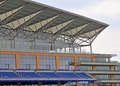
| 09/14/2010 11:54:16 AM |
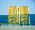
Grandstand Roofby SteveJComment: I think the triangles are not a major part of the photo, they should be more in foreground, this way they just look a small element. I would also straighten it out with the bottom stand. |
| Photographer found comment helpful. |
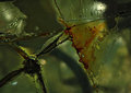
| 09/14/2010 11:49:37 AM |
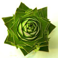
Piecesby meowComment: This is a good abstract picture, but I think the voters will be a bit confused about the triangle part, it's a bit hidden. I would increase the contrast and brightness to improve this photo. |
| Photographer found comment helpful. |
| 09/14/2010 11:48:23 AM |
swing seatby nicktonComment: This photo has a bit of feeling of a snapshot, it looks like it has not been planned and is a bit out of focus. |
| 09/14/2010 11:47:41 AM |
Naturalby Silent-ShooterComment: Good composition, and good colours, you could just whiten a bit more the whites, they look a bit pale. |
| Photographer found comment helpful. |
| 09/14/2010 11:46:22 AM |
Matched Setby Luci11eComment: This looks a bit too much like a snapshot, taken from the road or a car. As for processing, it could be somewhat improved by a black and white image with great contrast, it would be more interesting. |
| Photographer found comment helpful. |
| 09/14/2010 11:44:31 AM |
somehow colourful. somehow triangleby dancingsComment: It's very triangular :) But in this kind of composition, it should be centered, and at the moment it is not, and also it's a bit crooked. You should crop it square, and pay attention to the lines, we can see that they are not straight. Also, a boost in contrast and brightness would improve it a lot. |
| Photographer found comment helpful. |
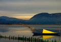
| 09/14/2010 11:43:10 AM |
Triangular Sailby andpolitisComment: I like the colour difference very much in this photo. The reflection does a good job at strengthening the composition, but the fence in the foreground makes the picture look like it's not been planned, but just snapshot. The ambiance is very good though. |
Home -
Challenges -
Community -
League -
Photos -
Cameras -
Lenses -
Learn -
Help -
Terms of Use -
Privacy -
Top ^
DPChallenge, and website content and design, Copyright © 2001-2025 Challenging Technologies, LLC.
All digital photo copyrights belong to the photographers and may not be used without permission.
Current Server Time: 08/16/2025 01:09:13 AM EDT.