|
|
| Image |
Comment |
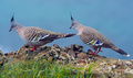
| 06/15/2007 06:43:09 PM | Pigeon Pairby owenComment: Greetings from the Critique Club
Great subjects here, really handsome birds. And a nice setting. I especially like the colors; even though the pigeons are mostly gray, there is enough color to make them really interesting.
The composition isn't bad, but there really needs to be a little more space to the left. There is a nice flow from the right side across the one bird's back and down it's beak to the other bird, and up it's back. But then it goes off the edge of the photo. Some space to the left of the bird would show that there is nothing interesting there, and make the flow stop at the left bird's eye, making that the focal point of the photo.
Another problem with the photo is that the subjects are not in sharp focus. Perhaps the focus was on the grass, which you nicely blurred to keep it from stealing attention. Ideally, the focus would be on the bird's eye. The photo also appears to be slightly oversharpened; there are halos at many of the edges. |  Photographer found comment helpful. Photographer found comment helpful. |
| 06/13/2007 12:00:43 AM | The Things I Carriedby EfergohComment: Greetings from the Critique Club
I love the feel of this photo. Warm, yet very dynamic. And very personal. The bible is subtle, but calls attention to itself just because it is so different from everything else. And it's placed perfectly to be the anchor for the photo; a place for the eye to rest and keep returning to as it explores the rest of the photo. Everything else is interesting; I look and enjoy the varied shapes and textures. But I don't linger; I return to the bible to ponder what it means to me, and what it must mean to you.
Technically, this is very well done. Good lighting (except for the reflection in the goggles). Perfect focus and exposure. It needs a little sharpening to bring out the details.
This isn't the kind of photo that normally does well in a challenge: too busy, and too difficult to appreciate in a couple of seconds while voting. Considering, it did very well!
But I've very much enjoyed this photo. Great job! | | Photographer found comment helpful. |
| 06/09/2007 07:08:19 PM | Frost hydrant sweatby snafflesComment: Greetings from the Critique Club
This photo really isn't about the water droplets. Which is good, because the droplets themselves aren't very interesting (nor really emphasized here). But not so good because it makes the connection to the challenge a bit tenuous; it doesn't jump out and say "Water!".
The hydrant is the real subject here, and the water droplets do add an interesting texture. The unusual point of view is creative, and I think it would work well if it wasn't so crowded at the top. There are a lot of diagonal lines here, which make the photo very dynamic. The bolt at the very top is a natural anchor here, and a lot of lines lead to it (like the handle). But it needs some space so the viewer's eye isn't pushed next to the edge. (If you did want a photo of the water droplets, you'd need to crop out that bolt; it draws the eye away from the droplets.)
The sky seems a bit bland here. I don't know if that's because the cooling filter makes the clouds disappear, or because the sky just isn't exciting at this time. A polarizer might have helped darken the sky and increase the contrast with the clouds. Or just a different time with better lighting would have made a more interesting photo.
I don't particularly like the way the fence "sticks out" of the hydrant. Removing it is probably too hard, but perhaps moving the camera just a bit would have improved its interaction with the hydrant. Hard to say without being there. (But the low viewpoint is definitely interesting here, so try to keep that!)
Finally, I have to agree with purpleflutterby13 that use of the cooling filter looks like an unintentional color cast here. While that filter can be useful, use of any filter needs to be subtle for best effect. | | Photographer found comment helpful. |
| 06/09/2007 01:23:23 PM | Mackay's Ice Cream - Since 1948by CitadelComment: Greetings from the Critique Club
I like the overall mood of this photo. The brown color of the props gives a nostalgic feel and contrasts nicely with the pastel colors of the ice cream. I like the composition (even if many DPC voters will find it too "busy"). The elements are obviously related, and each helps tell part of the story. The cone is well placed to have a lot of dynamic diagonal lines which all lead to the ice cream. The carton both adds context and helps direct the eye to the subject. The preponderance of nearly horizontal and vertical lines combines with the landscape format to give a feeling of stability, which is crucial since you're celebrating an establishment that's been around a long time. But there are plenty of diagonal lines to add excitement and interest.
The lighting here doesn't work very well; it's kind of jumbled and confusing. Although there are some clear shadows, there are also lots of faint jumbled ones that aren't flattering to the photo. And I'm guessing there is a combination of flash and fluorescent lighting, mostly because getting the ice cream colors correct has given the white bowl a bluish cast. You can try to fix it with the sponge tool in this particular case, but in general that's very difficult; it's best to avoid mixed lighting.
This photo is over-exposed, which has burned out important highlight detail in the subject. Other commenters have mentioned the lack of focus on even the front scoops. The focus is great; it's the over-exposure that's responsible for the lack of detail. Tools like curves or shadows/highlights can fix the tonal range, but there's no way to get back that detail.
I agree with several of the other comments that depth of field should have been larger here to get the last scoop in focus. But as I mentioned, I do like everything but the ice cream slightly out of focus as you have done here. | | Photographer found comment helpful. |
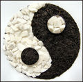
| 06/05/2007 08:14:13 PM | The Way of Heaven and Earthby NatashaComment: Greetings from the Critique Club
An interesting and fairly well executed view of the challenge. I especially like the imperfections: the stones that don't make a smooth arc, the not-perfectly-round containers, the slightly yellow color cast, the fact that it is upside-down. They are a great reminder that The Way is not as smooth and easy in practice as it is in theory. This is a universal fact that is true regardless of one's personal or cultural definition of the "Way".
I do wish some of the technical aspects were done better. The focus could have been better, and more depth of field would have been nice. The lighting is appropriate for the subject (harsher lighting would have enhanced the textures and made a more attractive photo, but the shadows would have put too much yin in the yang). But the photo is slightly overexposed, washing out many of the white stones; I find this mildly distracting. Granted, the high contrast of the subject makes this difficult, and perhaps even impossible to achieve without spot editing. | | Photographer found comment helpful. |
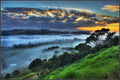
| 06/04/2007 08:41:27 PM | Elements in Harmony by NuzzerComment: Greetings from the Critique Club
This is a wonderful photo. But the voters already told you that! The ribbon is well-deserved. The vibrant colors really draw me in, and the view is breathtaking. There are a lot of good things to say, but two things really strike me here:
First, I love the way that the warm colors sandwich the cool colors. Since warm colors seem near and cool ones far away, this really enhances the depth of the photo. And the warmth at the top and bottom tie those two areas together, helping to unify the photo that's separated into 3 areas (sky, fog, and grass, with dark lines between them).
Second, the feel of the photo is overall peaceful, but with an undercurrent of excitement. The serenity comes from lots of horizontal (or nearly so) lines and the low contrast cool fog. But the strong diagonal line of trees in the far foreground and, of course, the rays of the breaking sun combined with the bright warm colors promise that won't last long!
I only have one complaint: The photo is only 6 1/2 inches wide on my screen. Not nearly big enough! | | Photographer found comment helpful. |
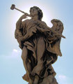
| 06/03/2007 12:12:04 AM | Hiding from the Sun.JPGby TemperpolkComment: Actually, I'm guessing the excessive noise here comes from lightening the statue, which I imagine was very dark due to the bright backlighting. One way to avoid this is to use a fill-in flash to make the statue light enough to begin with, but that would also change the shadows considerably, and I do like them the way they are here. (And if this is far away, like on a rooftop, the flash probably wouldn't reach.) A more complex alternative is to use a tripod and take multiple exposures, one with the background exposed properly (but the statue too dark) and one with the statue exposed well (but the background burned out), then combine these in Photoshop to get the best of both. | | Photographer found comment helpful. |
| 06/02/2007 11:51:33 PM | The Lone Red Flowerby kellyrc01Comment: Greetings from the Critique Club
My first impression looking at this photo was that the red flower didn't really belong. So I wasn't surprised to see your comment that you placed it there. It looks unnatural. But that isn't really important; photos, even flower photos, don't necessarily have to look natural. It depends on what message the photographer wants to get across. And this photo is attractive. The red flower does stand out, and makes the viewer wonder why it's there. There is no correct answer; the viewer gets to decide for himself. That's a hallmark of good art.
Now I want to disagree with Steve's critique a bit! Don't be frustrated by our disagreement; this is all subjective, and that's what makes art interesting!
I like the highly saturated red. The color amidst the gray already draws attention to it, and the intensity, well, intensifies this. I think it works very well. And I also like the reddish reflection; it helps the red flower blend in. Cloning it out makes the red flower look even more unnatural. (Of course, if that's your goal, go for it!) But there is a very light bluish hue on the petals behind and above the red flower that looks out of place; I do suggest removing it. (I would recommend using a layer mask on a hue/saturation layer rather than cloning to do this.)
While the soft focus is certainly fitting, these flowers have such a wonderful texture that I would prefer it sharper. A bit of sharpening to bring out the details would really enhance this.
But I do agree with Steve's recommendation to crop off the left side. That would better balance the composition. | | Photographer found comment helpful. |
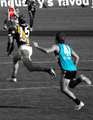
| 06/02/2007 10:22:32 PM | AFL Power vs Tigers - Good Markby SomeamateurComment: Greetings from the Critique Club
Good action shot. The players frozen in mid-air give a strong feeling of motion that nicely captures the excitement of the game. I really love the strong diagonal line that starts at 41's right foot, goes up the wrinkles of his shirt and through his left arm, then through the stripe on 15's shirt and up to the ball. You couldn't have gotten that better if you had been able to pose them!
I'm ambivalent about the selective desaturation here. Certainly having the ball in color is effective; it's the focal point here and that draws even more attention to it. And the color in 15's stripe helps it's role in the composition I described above. But the color in 41's shirt draws undue attention to itself and detracts from the composition slightly. However, I think having one player's uniform in color and not the other would look really strange. So this photo isn't really ideal for selective desaturation, but you've probably made the best choice here.
A major weakness in the composition is that the ball crowds the edge of the frame. Since it's the focal point, it needs "room to breathe". The photo would also be much better if the ball was in focus. | | Photographer found comment helpful. |
| 05/27/2007 11:44:51 PM | Leading lines to the horizonby sekarmalathyComment: Greetings from the Critique Club
I love this approach to the challenge. The composition is daring and effective. It defies the "rule" of composition that says the focal point shouldn't be too close to the edge, and it works. The many diagonal lines make this very dynamic and exciting. I especially like the way you've used the freeway at the far left edge as an anchor.
The overall darkness and warm colors work with the composition to create a great mood. And the varied shapes and forms of the buildings meld together to create a nice texture, which further enhances this mood. Everything just works together perfectly here.
This isn't a photo that everyone will enjoy or appreciate. But I certainly do! Great job. | | Photographer found comment helpful. |
Home -
Challenges -
Community -
League -
Photos -
Cameras -
Lenses -
Learn -
Help -
Terms of Use -
Privacy -
Top ^
DPChallenge, and website content and design, Copyright © 2001-2025 Challenging Technologies, LLC.
All digital photo copyrights belong to the photographers and may not be used without permission.
Current Server Time: 09/03/2025 03:14:59 PM EDT.
|