| Author | Thread |
|
|
06/02/2007 10:22:32 PM |
Greetings from the Critique Club
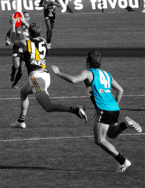
Good action shot. The players frozen in mid-air give a strong feeling of motion that nicely captures the excitement of the game. I really love the strong diagonal line that starts at 41's right foot, goes up the wrinkles of his shirt and through his left arm, then through the stripe on 15's shirt and up to the ball. You couldn't have gotten that better if you had been able to pose them!
I'm ambivalent about the selective desaturation here. Certainly having the ball in color is effective; it's the focal point here and that draws even more attention to it. And the color in 15's stripe helps it's role in the composition I described above. But the color in 41's shirt draws undue attention to itself and detracts from the composition slightly. However, I think having one player's uniform in color and not the other would look really strange. So this photo isn't really ideal for selective desaturation, but you've probably made the best choice here.
A major weakness in the composition is that the ball crowds the edge of the frame. Since it's the focal point, it needs "room to breathe". The photo would also be much better if the ball was in focus. |
|
 Photographer found comment helpful. Photographer found comment helpful. |
Comments Made During the Challenge  |
|
|
05/22/2007 06:11:10 AM |
|
Good choice for the challenge, really like the colors in this one. Also a good action shot. good luck 8 |
|
| Photographer found comment helpful. |
|
|
05/21/2007 05:20:00 PM |
|
| Photographer found comment helpful. |
|
|
05/21/2007 06:42:49 AM |
|
Good action shot, personally I think I would have preferred just the ball in colour |
|
| Photographer found comment helpful. |
|
|
05/21/2007 06:33:26 AM |
|
I don't like the use of selective colour here. It doesn't seem to have any purpose, and makes the whole photo feel unnatural. |
|
| Photographer found comment helpful. |
|
|
05/21/2007 12:16:00 AM |
Too much color, I think.
Selective color/desaturation is funny that way. There is a fine line between wow and overdone. This isn't over the top and gawdy mind you, but it is a bit much...not subtle. |
|
| Photographer found comment helpful. |
Home -
Challenges -
Community -
League -
Photos -
Cameras -
Lenses -
Learn -
Help -
Terms of Use -
Privacy -
Top ^
DPChallenge, and website content and design, Copyright © 2001-2026 Challenging Technologies, LLC.
All digital photo copyrights belong to the photographers and may not be used without permission.
Current Server Time: 06/29/2026 12:56:46 PM EDT.