| Image |
Comment |
| 02/08/2003 12:31:57 PM |
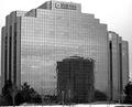
Windows and Mirrorsby MorganComment: Interesting.... I guess the reflected building shows the way a business starts out small and grows over time to become the big, shiny building. Very subtle and well composed. I like the grainy black and white. This is kind of a philosophical, thoughtful photo. |
 Photographer found comment helpful. Photographer found comment helpful. |
| 02/08/2003 12:28:03 PM |
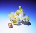
Popcornby MajorChaosComment: Simple and pretty. I'm sure a lot of people don't like your background, but I like it. The gradient is pleasant, and shows off the fluffiness of the popped piece of pop corn against the dark blue, while the kernel looks nice on white. The shadows are a little strong though. |
| Photographer found comment helpful. |
| 02/08/2003 12:26:24 PM |
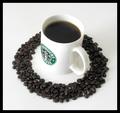
Dark Roastby JackoComment: I like the ring of beans, it looks nice against the white background. Unfortunately, the side of the coffee mug is indistinct from the background on the left side, which is kind of distracting. Also, the coffee itself, in the mug, has an odd tint to it... but from my time in the US I associate weak coffee with Starbucks, so I guess that might be why :P. |
| Photographer found comment helpful. |
| 02/08/2003 12:23:43 PM |
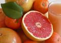
From Fruit to Juiceby nathaliedooComment: Luscious and tangy. I think this photo strikes the right balance. It's loaded with content and things to look at, but the composition ties it together, particularly with that bright pink circle of grapefruit flesh and green leaf. Nicely done. |
| Photographer found comment helpful. |
| 02/08/2003 12:21:34 PM |
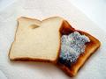
Bread and Toastby jab119Comment: I'm not sure that the kitchen paper works as a prop. It undermines the texture of the bread a bit. I think I would actually prefer the toast to be the top piece, because the plain piece of bread isn't as interesting to look at. |
| 02/08/2003 12:20:26 PM |
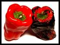
Roastedby SonifoComment: Nice idea. I think the lighting is a bit harsh. The colours are really bright and bold, but the shiny spots and dark shadow make them seem a bit overpowering. |
| Photographer found comment helpful. |
| 02/08/2003 10:47:00 AM |
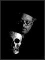
Self Portrait by jjbeguinComment: I love it! Momento Mori at its most gritty. I'm a bit indecisive about the way both "heads" are cut off at a slant at the top. It seems like both are wearing berets or something! It's kind of distracting, but maybe in a good way? Love the lighting and deep black tones. The skull glows out of the darkness. |
| Photographer found comment helpful. |
| 02/08/2003 10:43:14 AM |
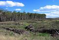
Loggingby PtmanComment: Looks Australian! This photo makes me really sad. I think it's a little busy though, and the colours seem a bit odd. That sky almost seems too blue. |
| 02/08/2003 10:41:24 AM |
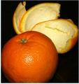
Peeledby svitalComment: Strange border, thick on 2 sides and thin on 2 sides. The composition is decent, but there are odd effects in the background. The lighting is a little harsh. More diffusion (with paper or cloth over the light) would help get rid of that hotspot on the orange. |
| Photographer found comment helpful. |
| 02/08/2003 10:39:31 AM |
|
| Photographer found comment helpful. |
Home -
Challenges -
Community -
League -
Photos -
Cameras -
Lenses -
Learn -
Help -
Terms of Use -
Privacy -
Top ^
DPChallenge, and website content and design, Copyright © 2001-2025 Challenging Technologies, LLC.
All digital photo copyrights belong to the photographers and may not be used without permission.
Current Server Time: 08/27/2025 04:46:48 PM EDT.