| Image |
Comment |
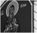
| 03/02/2003 09:50:42 AM |
Protectorby pitsamanComment: Neat. I think this would be great for stock photography. I can imagine it illustrating an article or a pamphlet on religion. I like the angle you took this photo at, and I think black and white works well in making it appropriately bland to be a backdrop to other material without losing its interest. |
 Photographer found comment helpful. Photographer found comment helpful. |
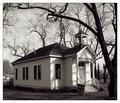
| 03/02/2003 09:46:43 AM |
One Room Schoolhouseby TarbiniComment: Lovely. Those trees are amazing in black and white. The perspective on the building is very fetching. I'm not sure about it being good for stock photography, but as a free study photo it's gorgeous. |
| Photographer found comment helpful. |
| 03/02/2003 09:45:20 AM |
laptopby kosmikkreeperComment: Very professional, and great for stock photography as I understand it (plenty of space for text). |
| Photographer found comment helpful. |
| 03/02/2003 09:44:17 AM |
Salt and Pepperby BigSmilesComment: Interesting idea, probably quite good for stock photography (I'm a bit unsure though). The texturing on the lids really appeals to me. The framing seems a little awkward, but I really enjoy the softness of the glass way back there outside the depth of field. |
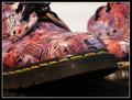
| 03/02/2003 09:42:10 AM |
My Foot in the Door ...by CreativeFlyPhotoComment: Crazy shoes. Cool shallow DOF and framing. I like the colours and textures here. The subject matter doesn't grab me, but your technique is full of flair :). |
| Photographer found comment helpful. |
| 03/02/2003 09:41:04 AM |
Seeing Beyondby NatashaComment: Neat. I'm not sure it qualifies for "stock photography", but as a free study photo it is cool and unusual. Nice colours, and I enjoy the sense of mystery created by all that negative space. |
| Photographer found comment helpful. |
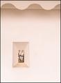
| 03/02/2003 09:39:27 AM |
A Prize Insideby sherComment: Not a very appealing photo. The light is very strong, and it's too tightly cropped. I would like to see it with a wider aperture (if you can control that) because it would give the photo more depth. |
| Photographer found comment helpful. |
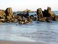
| 03/02/2003 09:37:46 AM |
Ocean on the Rocksby myqylComment: The light is a little strong, making the sky overexposed to the point of being white. However, I kind of like the harsh, black shadows on the rocks because it emphasises their cragginess. The sheen of the water on the sand is good too. |
| Photographer found comment helpful. |
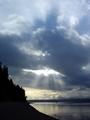
| 03/02/2003 09:31:00 AM |
Sunraysby timj351Comment: Classic sky shot, very well composed and exposed. |
| 03/02/2003 09:29:40 AM |
Baby's First Stepsby inspzilComment: As much as I love kittens, I've always thought newborns looked like mutants! You did well to take what seems like a really formal, studio style photo of this guy, but there are some problems with it. I like the soft focus look, I think that's fine, but the tonal depth is a bit flat, the composiiton doesn't seem tight, and it seems a little bit underexposed to me. The huge shadow over the kitten's front paw (the one on the side near the camera) has an odd effect. |
| Photographer found comment helpful. |
Home -
Challenges -
Community -
League -
Photos -
Cameras -
Lenses -
Learn -
Help -
Terms of Use -
Privacy -
Top ^
DPChallenge, and website content and design, Copyright © 2001-2025 Challenging Technologies, LLC.
All digital photo copyrights belong to the photographers and may not be used without permission.
Current Server Time: 08/26/2025 09:15:22 PM EDT.