| Image |
Comment |
| 02/23/2009 09:24:33 PM |
Aprilby MaryOComment: cute. I would have liked a like more depth of field to have the whiskers sharper. I don't mind softness elsewhere--it fits with the picture. But sharp whiskers would feel better. |
 Photographer found comment helpful. Photographer found comment helpful. |
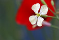
| 02/23/2009 09:24:21 PM |
End of the winterby ytshuvaComment: I like the shot very much, but the red doesn't seem to have anything to do with the shot, and lessens the beautiful blue/green background. Even if it had been someplace else in the picture, I think it would have been stronger than right behind the white flower. It immediately pulls my eye away. |
| Photographer found comment helpful. |
| 02/23/2009 09:24:16 PM |
March...Harbinger of Spring.by GenrOneComment: I like the idea of the light coming through the flowers. However, I think the front two could have benefited with a little of fill light. They just aren't as strong as the rest of the picture. It also would be interesting with a little more black background and placed off center. Your yellow and black combination is very effective. |
| Photographer found comment helpful. |
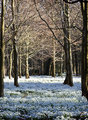
| 02/23/2009 09:20:03 PM |
March Snowdrops by bobonacusComment: I love the scene. Since it's advanced challenge, I'd play with the shadow/highlights option a little more though, bringing up the flowers & down the lighting in the trees. |
| Photographer found comment helpful. |
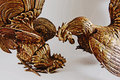
| 02/23/2009 09:19:55 PM |
October, the Month of the Rooster by Canonguy39Comment: Fun & clever idea. I brought it into photoshop to play a little, and I'd recommend selecting the background and lightening it to almost a white. I think keeping the background white, or perhaps using a softer brown/beige for a backdrop would make it stronger. The grey tone doesn't work as well with the wonderful browns in the rooster. |
| Photographer found comment helpful. |
| 02/23/2009 09:19:52 PM |
|
| Photographer found comment helpful. |
| 02/23/2009 09:19:45 PM |
|
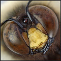
| 02/23/2009 09:19:39 PM |
April from "The Insect Calendar"by LydiaComment: Seems a little too close to me. I'd be interested to see what it looked like a little farther out. (It was odd, but I had to move back to really focus on it. ) |
| Photographer found comment helpful. |
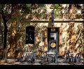
| 02/23/2009 09:19:03 PM |
Pubs - The Sail and Anchor - Februaryby dougi555Comment: I love the setting, but the shadows seem to make it too busy. Actually, it might be the combination of the shadows and the tree/leaves. Perhaps try a closer crop, getting rid of the tree and staying with the tables, door & shadows. I think it would look cleaner. |
| 02/23/2009 09:16:50 PM |
|
| Photographer found comment helpful. |
Home -
Challenges -
Community -
League -
Photos -
Cameras -
Lenses -
Learn -
Help -
Terms of Use -
Privacy -
Top ^
DPChallenge, and website content and design, Copyright © 2001-2025 Challenging Technologies, LLC.
All digital photo copyrights belong to the photographers and may not be used without permission.
Current Server Time: 09/01/2025 11:23:01 PM EDT.