| Image |
Comment |
| 08/07/2022 05:39:49 PM |
|
 Photographer found comment helpful. Photographer found comment helpful. |
| 08/07/2022 05:39:34 PM |
|
| Photographer found comment helpful. |
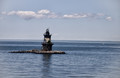
| 08/07/2022 05:39:04 PM |
Beacon of Lightby BarronessComment: Others have probably told you, but the horizon not being straight really messes with the photo. What a wonder spot, but I think you could have done more with the processing to bring this beauty out. -6- |
| Photographer found comment helpful. |
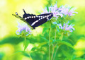
| 08/07/2022 05:38:03 PM |
galloping through the airby skewsmeComment: This is too smooth. And yet it is quite nice. I like the smooth everywhere except on the butterfly's wings. It just seems like that not having detail ruins the effect. Still a 7, though. |
| Photographer found comment helpful. |
| 08/02/2022 09:21:51 PM |
|
| Photographer found comment helpful. |
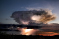
| 08/02/2022 09:19:53 PM |
Some Much Neded Rainby jcarComment: 7 - you need to clone out the sensor dust. and it looks like there's a hair on the left side (the curl near the top) Such a great image, but those things really detract from it. |
| Photographer found comment helpful. |
| 07/30/2022 09:42:19 AM |
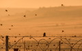
Guarding the emptinessby AmmieComment: This would have been so much more effective if there weren't a lot of birds flying. If he was the only bird, and the rest was empty, it would have been awesone. Especially the razor wire emphasizing that the world needs to keep out. It's an intriguing photo, but it just doesn't meet the challenge, imo. -5- |
| Photographer found comment helpful. |
| 07/30/2022 09:40:41 AM |
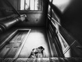
Silence where there used to be Soundby LydiaComment: I love the idea. I love the processing. The only thing of which I'm not sure is the tilt. It threw me off at first, then I thought "yeah -- that works", and then I changed my mind and didn't like it again. But I think the whole reason is seeing that 1/5 of the left side of the photo. That draws my eyes, since it's in the shadows, but still can be seen. I expect something wonderful in there, but then it's empty (yes, I know, emptiness) and I feel dissatisfied. I think I would have absolutely adored it if the photo was cropped in from the left and that whole corner, indent was left out. Or, if there was more of that area--maybe about 1.5 times the size it is now -- so that you realized the whole place was empty - not just that one part with the stool.
Is this an Anita? It reminds me of her toning. 7 for now. Probably moving to an 8. But I think it would have been a 9 with either of those thoughts. |
| Photographer found comment helpful. |
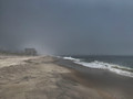
| 07/30/2022 09:35:30 AM |
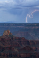
Barren Expanse by jcarComment: Your photography has gotten very good, but this one falls short, imo. The biggest rule in landscape photograph is: don't center your horizon. Have it fall at the 1/3 or 2/3s vertical.
That being said, it's a great rule to break with the right shot. This one, however, I don't think does the halfway-horizon justice. I think you would have been much better off with the horizon at the top 1/3. The clouds are quite nice, but not nearly as interesting as the lower portion, so they're given too much credit with this arrangement. -5- |
| Photographer found comment helpful. |
| 07/25/2022 08:57:33 AM |
Side eye by PaulComment: This is brilliant. I only gave it a 7, and I'm not sure why. Too fast on voting, I think. And rather disappointed with the entries (my own included). I need to go back and relook instead of rushing through.
This is pretty much the effect I was going for, and you succeeded where I failed. I found it very difficult to have a looking up shot look unusual or different.
Huge congrats on the blue!! |
| Photographer found comment helpful. |
Home -
Challenges -
Community -
League -
Photos -
Cameras -
Lenses -
Learn -
Help -
Terms of Use -
Privacy -
Top ^
DPChallenge, and website content and design, Copyright © 2001-2025 Challenging Technologies, LLC.
All digital photo copyrights belong to the photographers and may not be used without permission.
Current Server Time: 09/02/2025 07:00:47 PM EDT.