| Image |
Comment |
| 07/17/2005 12:15:30 AM |
|
 Photographer found comment helpful. Photographer found comment helpful. |
| 07/17/2005 12:14:43 AM |
Mother and Sonby twm122Comment: The focus seems to be on the tree in the background. Since advanced editing was allowed for this challenge, cloning out the glare on the woman's lipstick would have improved the shot. |
| Photographer found comment helpful. |
| 07/17/2005 12:12:25 AM |
Memories of Precious Momentsby Moose101Comment: It looks like the focus on the original image may have been too soft, and you then over-sharpened to try to compensate for this. The color cast makes this look like a faded family snapshot; if this was intentional, adding a little bit of noise might have helped to flesh out the effect. It may just be the odd shape of the shore in the background, but the horizon feels like it's tipped slightly. |
| Photographer found comment helpful. |
| 07/17/2005 12:06:42 AM |
family get-awayby beafliesComment: I'd love to know where this photo was taken. I would be interested in vacationing there myself some day.
The mottled light on the people in the foreground is distracting. Under the given lighting conditions I think that composing the shot so that the figures were closer to the waterfall would have produced a stronger photograph. |
| 07/16/2005 11:56:42 PM |
Sistersby dave2119Comment: This is a cute pose and a very nice candid. On a technical note, the DOF is too shallow and brings unnecessary attention to the younger girl's hair. |
| Photographer found comment helpful. |
| 07/16/2005 11:53:46 PM |
Pool Playby dfriedlandComment: The focus is rather soft and seems to have been centered on the water behind the boy. A faster shutter speed or deeper DOF may have corrected this. The crop above the kid seems a bit too aggressive to me; I'd rather see a bit more headroom. |
| Photographer found comment helpful. |
| 07/16/2005 11:51:34 PM |
That sea of shallow facesby strangeghostComment: Although a very creative photo of a family could have been made with these masks, this image doesn't appear to demonstrate any attempt to relate them to the challenge topic. |
| Photographer found comment helpful. |
| 07/16/2005 11:49:34 PM |
Family Outingby blemtComment: The horizon doesn't look level; see this page for information on how to correct this. Because the only strong color in the image is the red street I think that the composition would have been improved by either converting this to B&W or by desaturating only the street. Without the clue provided by the challenge topic I'd be hard pressed to decide whether this was a photo of the statuary which three people happened to wander into or a snapshot of a family vacation. Shooting this from a low angle with the people standing near the monument and the stone figures towering over them would have been a much stronger image. |
| Photographer found comment helpful. |
| 07/16/2005 11:41:26 PM |
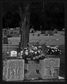
Generations Pastby msdoubletroubleComment: There is no clear point of focus in this image. The focus seems sharpest on the bright white headstone, but since it's occluded by the larger items in the foreground it's probably not the intended subject. A much narrower DOF and composition which clearly indicated the intended subject would have helped this image dramatically. |
| Photographer found comment helpful. |
| 07/16/2005 11:35:37 PM |
Patriarch of the Ancestral Groundsby JutildaComment: This looks underexposed and unevenly lit. The framing of the headstone feels uncomfortable. I think that you'd be better off centering the image, or placing it about a third of the way from the edge; some additional breathing room above the tombstone would be nice too. Rendering this in B&W was a good choice, but the low contrast muddies the textures (which look like they might have otherwise been a strong compositional element). Adding some noise would have given this image a more nostalgic feel, which I think would have reinforced the mood. |
Home -
Challenges -
Community -
League -
Photos -
Cameras -
Lenses -
Learn -
Help -
Terms of Use -
Privacy -
Top ^
DPChallenge, and website content and design, Copyright © 2001-2025 Challenging Technologies, LLC.
All digital photo copyrights belong to the photographers and may not be used without permission.
Current Server Time: 08/23/2025 09:23:36 AM EDT.