| Image |
Comment |
| 09/04/2005 02:11:49 PM |
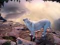
Dusk & Labradorby hideoutComment: This has been sharpened so much that several of the elements look like they've been pasted in from other pictures. |
 Photographer found comment helpful. Photographer found comment helpful. |
| 09/03/2005 11:36:22 PM |
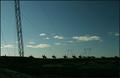
Dock & Lampsby pinbokeshattaComment: I like the leading lines of the lamps. This image would be stronger if there was something at the end of the trail of lamps. I find the uneven horizon distracting. |
| Photographer found comment helpful. |
| 09/03/2005 11:34:05 PM |
|
| Photographer found comment helpful. |
| 09/03/2005 11:31:31 PM |
Dreadlocks & Lollipopsby dsa157Comment: Somehow the desaturation makes those look less like lollipops. I think that this would have been better in color. |
| Photographer found comment helpful. |
| 09/03/2005 11:29:01 PM |
|
| 09/03/2005 11:27:30 PM |
|
| Photographer found comment helpful. |
| 09/03/2005 11:25:10 PM |
Dustpan & Licoriceby loveComment: The combination of these elements seems random. If the colors, textures, shapes, or other features clearly complemented each other this would feel more natural; as it is this seems like objects were selected purely for their relation to the topic. |
| 09/03/2005 11:21:14 PM |
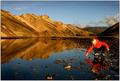
Dream Landscapeby arngrimurComment: This is a wonderful landscape photo. I have mixed feelings about the model; her inclusion in the frame competes with my attention to the mountains behind her, but she does seem to add balance to the water section of the image. If the DoF were shallow enough that the mountains weren't in focus, I think that her presence would work well. Shooting this as mountains + water or water + girl would produce a balanced feel, but including all three feels slightly off. |
| 09/03/2005 11:12:07 PM |
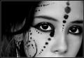
d o t s -&- l i n e sby annahComment: This looks a little oversharpened, and the lack of texture on the face makes the model look somewhat plastic and artificial. Something about the large spot running from the edge of the eye looks odd. The lighting is good, and the catchlight draws attention to her eyes with good effect; the DoF is good. Nicely done Annah. |
| Photographer found comment helpful. |
| 09/03/2005 11:07:02 PM |
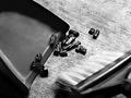
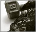
"Dumbell and Lace..."by tfarrell23Comment: If the the dumbbell had a rougher texture you would have an interesting contrast between it and the lace. Without that contrast the combination of these two objects seems random. |
| Photographer found comment helpful. |
Home -
Challenges -
Community -
League -
Photos -
Cameras -
Lenses -
Learn -
Help -
Terms of Use -
Privacy -
Top ^
DPChallenge, and website content and design, Copyright © 2001-2025 Challenging Technologies, LLC.
All digital photo copyrights belong to the photographers and may not be used without permission.
Current Server Time: 08/21/2025 09:53:32 AM EDT.