| Image |
Comment |
| 03/10/2009 06:15:11 AM |
1933 million years old ROCKby panomavComment: I can't actually make out what this rock is all about. Is it part of the landscape or has it been placed there? Also, I don't really see the relevance of the 1933 (water?) access port, unless of course the rock is part of the pavement and the two of them just happen to be together. |
| 03/10/2009 06:12:28 AM |
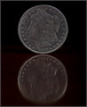
Lady Libertyby NobodyComment: There's quite a lot of these in the challenge, but this is one of the better ones. I think the reflection has helped this one along a bit. I'm not sure about the lighting, it seems you have some direct front on light which has given the coin a very scratchy silvery look.
I often find when I'm doing a shot of something like this it often ends up better when I use ambient or low lighting and go for longer exposure. |
 Photographer found comment helpful. Photographer found comment helpful. |
| 03/10/2009 06:10:06 AM |
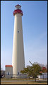
Cape May Light (1859)by SteefComment: Nice and simple well lit shot. The tree doesn't help but what can you do! I don't know what is in the surrounding area but this might also have been nice if you had taken it in landscape format from further back with a lot of empty blue sky around it. |
| Photographer found comment helpful. |
| 03/10/2009 06:08:31 AM |
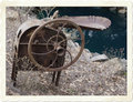
Blowtorch (Circa 1900)by GreatJobBobComment: You've done something a little strange with this shot, and my guess is messing with the curves to black out the background (or achieve some other effect) but it has resulted in a weird look to everything which doesn't help at all. |
| Photographer found comment helpful. |
| 03/10/2009 06:04:11 AM |
Casina Vanvitelliana (1782)by Rino63Comment: This shot has a lot of nice elements, which for the large part work well together.
I think you may have over sharpened the shot, which is most apparent where the hill in the background meets the sky, there is a very defined edge. Also, there is a quite obvious halo around everything.
Lastly, the colour in the sky, while being nice for a sunset or landscape shot, is a little overwhelming here and detracts from the main subject. |
| Photographer found comment helpful. |
| 03/10/2009 06:01:19 AM |
GG's Bible - Christmas, 1896by 777STANComment: The book itself certainly looks interesting but there's a lot wrong with the shot.
First and most obvious is what looks like a duvet or sheet in the lower left with what I think is a hand holding it. Next is the background, I'm guessing it's a bed and I'm not sure what made you choose that, I think a desk or stone would have made a much better simpler background to keep emphasis on the book.
Lastly is the way you have chosen to take the shot. For me most of the interest is in the front cover and I think this should have been your main focus, but you have left it at an angle partially covered up and made the focus the hand written text. I can see the need to include the date but I think you could have found a better way to present this. |
| Photographer found comment helpful. |
| 03/10/2009 05:56:59 AM |
Miss Marion's Dollby banmornComment: This is a very nice well lit portrait of the doll. I'm not completely sure about the black background but otherwise great shot. |
| Photographer found comment helpful. |
| 03/10/2009 05:55:47 AM |
Knowledge for the People - 1865by TallPaulComment: There's too much in this shot. I can see that you are getting at the encyclopaedia, but then you have the lamp in the shot, which isn't really helping.
Also the layout you have chosen for the books might have been better. The part of the spine I can see in one looks really nice, perhaps try lining them all up as in a bookshelf with one lying open on the end, just a suggestion :) |
| Photographer found comment helpful. |
| 03/10/2009 05:51:59 AM |
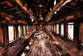
Last Train To Chattanoogaby JulietNNComment: This is a great scene, love the textures in the wood and the colours. You're angle is a little obvious, it might be good to take this from low down next to those wooden floorboards. |
| Photographer found comment helpful. |
| 03/09/2009 09:37:09 AM |
Oldby scarman1313Comment: I'm guessing from the edges you have a photo of a photo here (or possibly a stamp in which case you're probably going to get DQ'd.
Judging the photo alone (as it's not my job to judge DQ's), it's initially too small, it's also a touch blurry, though that could be down to the small size, and I'm not really sure what the subject is. The colours are a bit flat and you have a weird angle thing going on there. |
Home -
Challenges -
Community -
League -
Photos -
Cameras -
Lenses -
Learn -
Help -
Terms of Use -
Privacy -
Top ^
DPChallenge, and website content and design, Copyright © 2001-2025 Challenging Technologies, LLC.
All digital photo copyrights belong to the photographers and may not be used without permission.
Current Server Time: 08/06/2025 01:39:35 PM EDT.