| Image |
Comment |
| 04/12/2009 08:30:19 AM |
Week 14 - 60sby shalrathComment: The look is definitely washed out, but I don't think it's worked perfectly. I read a good tutorial about achieving that sort of effect in photoshop, might be what you're looking for:
//veerle.duoh.com/blog/comments/photoshop_vintage_effect/ |
 Photographer found comment helpful. Photographer found comment helpful. |
| 04/12/2009 08:22:55 AM |
A Kiss of Freedomby kellymkComment: Wonderful capture, especially with the razor wire fence in the foreground, which really adds something to the shot! |
| Photographer found comment helpful. |
| 04/12/2009 08:21:57 AM |
Week 13by KenComment: Funny, I also thought it looked like some weird alien landscape and then I read the other comments! Makes me dizzy to look at too long. |
| Photographer found comment helpful. |
| 04/12/2009 08:19:52 AM |
hadeda Ibisby sulamkComment: Love the details in the feathers. Great capture with the super short DOF which you can see from the roof tiles! |
| Photographer found comment helpful. |
| 04/12/2009 03:25:46 AM |
Curtis 1264 edit 2by MelethiaComment: Just came across this, I REALLY like it! Had a look at the others too, this is easily the best edit. Thanks for sharing the steps! |
| Photographer found comment helpful. |
| 04/10/2009 09:34:56 PM |
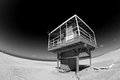
Wish You Were Hereby BrianRComment: Where? Nice shot, but you have given absolutely no indication of where it is, which is something I think a postcard is intended to do. |
| Photographer found comment helpful. |
| 04/10/2009 09:34:15 PM |
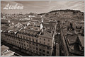
Greetings from Lisbon!by halopesComment: I imagine these buildings are very colourful and I'm not sure why you would choose to change it to a B&W shot.
If you had kept colour you would have the contrast of the whites and yellows of the buildings against the blue of the sky, which I believe would have looked a lot nicer. As it is, with the B&W it just looks quite flat and uninteresting. |
| Photographer found comment helpful. |
| 04/10/2009 09:27:59 PM |
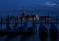
Venice, Italyby good_hamComment: Way too dark, there's enough detail there so I think you could have lightened this up. Other than that it's a pretty nice shot. |
| Photographer found comment helpful. |
| 04/10/2009 09:26:48 PM |
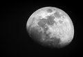
The Mooby Andrew1023Comment: I know I'm probably going to be the 200th person to say this, but "The Moo"? |
| Photographer found comment helpful. |
| 04/10/2009 09:24:36 PM |
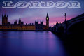
Londonby dainmcgowanComment: Nice shot, though I would have liked to have been able to see a bit more detail, perhaps a bit more exposure would have helped. I don't think the text really fits well with the placid sombre mood of the photo. |
| Photographer found comment helpful. |
Home -
Challenges -
Community -
League -
Photos -
Cameras -
Lenses -
Learn -
Help -
Terms of Use -
Privacy -
Top ^
DPChallenge, and website content and design, Copyright © 2001-2025 Challenging Technologies, LLC.
All digital photo copyrights belong to the photographers and may not be used without permission.
Current Server Time: 08/07/2025 05:41:56 PM EDT.