| Image |
Comment |
| 10/22/2013 12:50:48 PM |
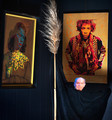
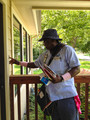
Catcher in the Wryby daisydavidComment: So I guess catcher in wry would be the wry look on the faces. I personally do not like this image. I am sure there is a reason behind each piece in the image, but it feels very disjointed to me. In my opinion, the composition of the image needs to be changed. I think the lighting of the rye? (only on the top) is good. I don't care for the white guy at the bottom or the reflection of Jimi in the other picture.
Gave it a 2 |
 Photographer found comment helpful. Photographer found comment helpful. |
| 10/22/2013 12:50:32 PM |
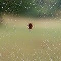
Charlotte's Webby glad2badadComment: Overall the image is just ok. I like the water droplets in the web, and I like the light green and tan colors of the background. The dark green doesn't fit to me. A different angle perhaps would have made the background better.
I would also liked to have seen more detail on that spider.
Gave it a 4 |
| Photographer found comment helpful. |
| 10/22/2013 12:48:33 PM |
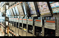
1984 - George Orwellby FourPointXComment: Great idea. I like it the way it is, and I don't know if the end of the picture is the end of the racks, but if possible it would have been great to have a different angle and pick up more of the hardware.
Gave it a 6 |
| Photographer found comment helpful. |
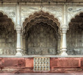
| 10/22/2013 12:47:13 PM |
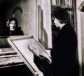
The Picture of Dorian Gray by mrchhasComment: Great photo. I like the composition and the lighting. My one criticism is the door frame on the left. Cropped out with maybe a little of the guy's back cropped out too would have made this a little better.
Gave it an 8 |
| Photographer found comment helpful. |
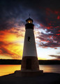
| 10/22/2013 12:45:19 PM |
To the Lighthouse: Virginia Woolfby vikasComment: I like the colors in this. The whites in the sky are a little too bright for me. Your intention may have been to have the lighthouse centered, but I think shifted a little to the right would have been nice.
I would also like to see a little more detail in the lighthouse. Maybe a fill light or a Brightness/Contrast mask to bring it out a little more.
Gave it a 5 |
| Photographer found comment helpful. |
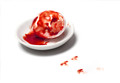
| 10/22/2013 12:42:38 PM |
Brave New Worldby UrfaKComment: Great photo. I honestly can't remember if I read the book, or if I was supposed to and I just heard the lecture on it. From what I remember, people were being produced instead of natural selection. If that is the case, then somehow making tiny human footprints with the "blood" would have taken this up a notch.
Still gave it an 8 |
| Photographer found comment helpful. |
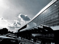
| 10/21/2013 09:33:24 PM |
City-of-Glassby artistChanComment: I like the composition of the photo. I don't get city of glass out of this shot though. Looks like an architecture photo and that architecture has some windows in it.
Gave it a 5 |
| Photographer found comment helpful. |
| 10/21/2013 09:31:31 PM |
|
| 10/21/2013 09:30:09 PM |
The Postman Always Rings Twiceby LinMalAngComment: Obviously I get the title and the picture. Other than that connection, I don't really feel anything in this shot...seems very ordinary.
Probably hard to get the guy to do any acting for you, but the shot could have been done at a different angle...maybe from behind. Can't see his face, maybe some fill lighting. Maybe a dark feeling to the pic would have helped.
Gave it a 3 |
| 10/19/2013 11:01:40 PM |
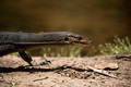
Call of the Wild by BarbBComment: I like the detail of the lizard, and I like the background. However other than being a "wild" animal, this has nothing to do with the book. This book title was too easy to play off of and doesn't seem like any thought was put into it other than, "Hey, I will take a picture of a lizard and call it Call of the Wild".
Gave it a 4 |
| Photographer found comment helpful. |
Home -
Challenges -
Community -
League -
Photos -
Cameras -
Lenses -
Learn -
Help -
Terms of Use -
Privacy -
Top ^
DPChallenge, and website content and design, Copyright © 2001-2025 Challenging Technologies, LLC.
All digital photo copyrights belong to the photographers and may not be used without permission.
Current Server Time: 07/31/2025 01:21:01 PM EDT.