| Image |
Comment |
| 08/24/2002 06:38:00 PM |
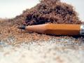
Sigh...by lisaeComment: very cute idea, though the lighting is very poor. with the right lighting and better framign this shot could've been great. |
 Photographer found comment helpful. Photographer found comment helpful. |
| 08/24/2002 11:43:00 PM |
|
| 08/24/2002 11:44:00 PM |
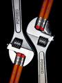
Red and White by RemieComment: So very well done. I wish the reds could match a little more tho. |
| 08/24/2002 06:44:00 PM |
|
| 08/12/2002 10:41:00 AM |
Blanketsby GinaRothfelsComment: Haha, nice find. Fits the challenge perfectly. As for technicalities, maybe a better framing job could've been done, too much space on the left, too little on the right. |
| 08/14/2002 02:09:00 PM |
the newest dragonby heartsdivideComment: Nice shot, but it hardly relates to the challenge. The crop on top may be a little too tight -- nothing else was cut off. |
| 08/14/2002 02:07:00 PM |
|
| 08/12/2002 10:24:00 AM |
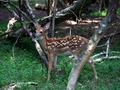
fawnby KrazyKatComment: Wow, the fawn really stands out. I wish the tree wasn't on the right, it's a bit distracting. Otherwise great composure and focus. |
| 08/12/2002 10:19:00 AM |
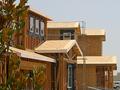
Web Designerby HendrikComment: This had SUCH potential, but due to blue/focus problems, I can't give it a high score. |
| 08/14/2002 02:05:00 PM |
Still Growingby amnonComment: The tilt doesn't work well for composure, I'd try a different angle or align it up vertically. |
Home -
Challenges -
Community -
League -
Photos -
Cameras -
Lenses -
Learn -
Help -
Terms of Use -
Privacy -
Top ^
DPChallenge, and website content and design, Copyright © 2001-2025 Challenging Technologies, LLC.
All digital photo copyrights belong to the photographers and may not be used without permission.
Current Server Time: 08/16/2025 12:54:52 PM EDT.