| Image |
Comment |
| 05/20/2002 07:01:00 AM |
|
| 05/26/2002 11:00:00 PM |
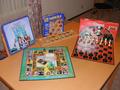
Some Of My Favoritesby lcgleahComment: Seems snapshotted, though I know you took time to set up the games. Looks almost like an ebay -- not much thought went into it. I could be very wrong though. It just lacks a lot. |
| 05/26/2002 08:32:00 AM |
|
| 05/23/2002 10:16:00 AM |
Monopolyby tomlewis1980Comment: I would prefer to see the focus higher up in the image or more to the right. I think the DOF is perfect, but that "MONOPOLY" and the board and the car should be in focus, not the 100. |
| 05/20/2002 07:02:00 AM |
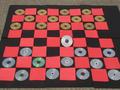
CD Checkersby SwashbucklerComment: Hehe, nice idea. I showing carpet isn't appealing, and I'm wondering why the one CD in the middle is angled up? |
| 05/20/2002 01:00:00 PM |
Aggravationby tjpierreComment: The top left and right corners of the background are somewhat distracting. I do like the swirls though. |
| 05/23/2002 09:39:00 AM |
|
| 05/22/2002 09:34:00 AM |
White to Moveby AndyLeeG4Comment: Nicely shot, though there's a lot of dead space at the top and not at the bottom, a better vertical centering job could've been done. |
| 05/20/2002 01:04:00 PM |
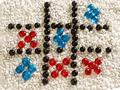
Triple Letter Scoreby insipidangelComment: The lighting/saturation on the image seems a bit off. Mostly on the "games" blocks, it's very off. I think a straight down apprach, rather than an angle would've worked out nicer too. |
| 05/26/2002 08:36:00 AM |
Surroundedby albapeteComment: Nicely done. I like the idea, but the foreground pieces may be a bit too out of focus. |
Home -
Challenges -
Community -
League -
Photos -
Cameras -
Lenses -
Learn -
Help -
Terms of Use -
Privacy -
Top ^
DPChallenge, and website content and design, Copyright © 2001-2025 Challenging Technologies, LLC.
All digital photo copyrights belong to the photographers and may not be used without permission.
Current Server Time: 08/24/2025 02:46:24 AM EDT.