| Author | Thread |
Comments Made During the Challenge  |
|
|
05/25/2002 05:03:00 PM |
|
|
|
05/24/2002 02:46:00 PM |
|
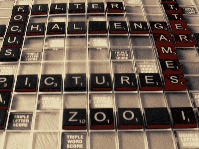
Are these old game tiles that are loosing their color or is this something funky from the compression? Can't make up my mind. In any case, nice setup, the focus should've been more in the front of the shot, IMO. |
|
|
|
05/23/2002 08:17:00 PM |
|
I think I like this....I'm not sure what it is exactly that appeals to me...and that's not a put down, it's just that it's B&W and.....I'm really not sure what you did to it. It makes it look really old and it's better than having those board colors come through. I think it was a good thing that the color is gone from this....less distracting. |
|
|
|
05/23/2002 11:52:00 AM |
|
I almost bought a Scrabble game just for this challenge. |
|
|
|
05/23/2002 05:11:00 AM |
|
Just curious, how come some of the letters are missing? -Nicole |
|
|
|
05/22/2002 09:39:00 PM |
|
not real crsip, seems out of focus |
|
|
|
05/22/2002 02:55:00 PM |
|
The phooto is a bit out of focus and I am not sure what effect you were using with the shot to produce the posturized shadows of the pieces. I think if you took a couple more shots of this you would of gotten better framing of the shot and the words would all been completely in the shot. You could of also tried various lighting sources for this shot. |
|
|
|
05/22/2002 06:17:00 AM |
|
Scrabble? I think maybe b&w would have looked better. |
|
|
|
05/21/2002 04:47:00 PM |
|
I love the color on this, but wish it was a little sharper and less hot spots. The blanks draw my attention - I keep wanting to look at the 'empty space'. But the coloring is really nice. good job. |
|
|
|
05/21/2002 03:04:00 PM |
|
I like the sepia tones here. Seems like you put a lot of effort into spelling things out here. The lighting seems pretty harsh to me. |
|
|
|
05/21/2002 10:23:00 AM |
|
I think I'd prefer the focus to be on 'pictures'. The glare from the board, especially the double letter score squres doesn't help either |
|
|
|
05/21/2002 06:32:00 AM |
|
was this with a filter? i like the effect a Lot ...too bad it's not more in focus |
|
|
|
05/20/2002 08:01:00 PM |
|
this was the first idea that came into my head, that's why i didn't use it(too obvious) |
|
|
|
05/20/2002 02:34:00 PM |
|
The colors are awesome, but the glare from the light is to much on some of the double letter score blocks. |
|
|
|
05/20/2002 02:27:00 PM |
|
What happened to these tiles on the right? Are they just worn out? The image appears to be suffering from over processing after the photo was taken... I'm not sure what part of the processing may have caused this... |
|
|
|
05/20/2002 01:57:00 PM |
|
Nice idea. A little dark and out of focus. |
|
|
|
05/20/2002 01:20:00 PM |
|
I like how you've included photo and site related words. |
|
|
|
05/20/2002 01:16:00 PM |
|
whats the point of the blanks in the photo. |
|
|
|
05/20/2002 01:04:00 PM |
|
The lighting/saturation on the image seems a bit off. Mostly on the "games" blocks, it's very off. I think a straight down apprach, rather than an angle would've worked out nicer too. |
|
|
|
05/20/2002 11:07:00 AM |
|
Very nice shot. I like the tone, would only wish for better focus here. |
|
Home -
Challenges -
Community -
League -
Photos -
Cameras -
Lenses -
Learn -
Help -
Terms of Use -
Privacy -
Top ^
DPChallenge, and website content and design, Copyright © 2001-2026 Challenging Technologies, LLC.
All digital photo copyrights belong to the photographers and may not be used without permission.
Current Server Time: 06/28/2026 10:29:00 AM EDT.