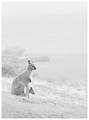
Wide Worldby
ImagineerComment by ergo: Hi, from the Critique Club!
Just my darn luck to have gotten this image to "critique" when I push that button. This, I reckon, is an intimidating image to even attempt a critique at, for me and probably for many other members of DPC. But I'll give it a try, keeping in mind that you're infinitely much more accomplished as a photographer/post-processor.
I like the image. In terms of challenge theme, I agree that this is quite minimalist and works at that level. The post-shot treatment works well for the context of the challenge, but I do think this would be a strong image as well without the desat and channel mixing (I'm still learning PS, and from my limited experience and knowledge, I think this is one possible technique for getting the white out, correct me if I'm wrong).
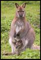
I like how the background isn't evenly blanked, and that a hint of details is left to show. Such a background strengthens the nicely picked and imaginative title.
The texture on the mother wallaby nicely sets off the main element from the rest of the image, and in a setting where bokeh isn't so visible due to the color tone choices, this texturing serves well as a magnet for the viewers' eyes.
The composition works well vertically, but I'd be curious to see how a landscape crop might affect this composition. "Wide World" brings to mind such a composition, and maybe the image would be stronger with a wider or longer viewing space for the wallabies.
The sticks and a band of darker tones near the top of the image present distraction points for me, but of course with basic editing there wasn't much that could be done for them.
I agree with some previous commenters that this would make a great print, and I hope to see some edits on this in the future. Thanks, and I hope this commentary doesn't prove to be too unworthy. :)