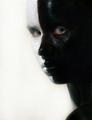
DPChallenge: A Digital Photography Contest You are not logged in. (log in or register
 
Browse Settings
Currently viewing:
Registered UserLadyK

Show comments:

Per page:

Order:

Comments:


Comments Received by LadyK
Pages:   ... [57] [58] [59] [60] [61] [62] [63] ... [132]
Showing 591 - 600 of ~1320
Image Comment
Washinton Monument in Fall
12/27/2008 02:37:33 AM
Washinton Monument in Fall
by LadyK

Comment by ShutterPug:
Very nice falls colors here. You may want to adjust the contrast a bit to make them pop more.
Photographer found comment helpful.
Searching For His Girl
12/27/2008 02:22:00 AM
Searching For His Girl
by LadyK

Comment by Gordon_1:
I feel you captured the right shot some one sure had his attention and the DOF is exellcent i love those big horns ..good shot jdubs:)
Photographer found comment helpful.
The Mask I Must Wear
12/27/2008 01:19:31 AM
The Mask I Must Wear
by LadyK

Comment by Tez:
okie doke... comments commencing.

First thing I notice is how you missed some of the paint in the central line so your skin shows through. Also, if you'd smoothed the paint a bit out (or just used the spot healing brush) on the lumpy parts it would have made it look a lot more 'organic' I suppose.

Second thing I notice is the sort of yellowy tinge around your face. You could have fixed this easily but didn't, and I would have marked it down for this as it's a simple oversight. To fix this, there's a number of ways: carefully dodge the area at around 40% or so on a different layer and erase the parts of the face you blow out because of it; make a levels layer to lighten it; or hell, just use a white brush. Easy, but ignored.

Third thing that gets me is the red around the eyes. Maybe its very irritating paint but it isn't the best look. You could have fixed this in PS by changing the colour of the reds to something a bit nicer looking or by making them black/white in PS also, this could have been done by selectively desaturating it i guess (easiest way).

4- the eyes... they don't really stand out enough. You can see them, but they should always be the focal point of a portrait, and in this they're not impactive enough to really make me look twice at the picture. It's nice enough but the eyes are the key and usually deserve special attention.

On a sidenote i'm not too sure why you went with this pose, it kind of diminishes the effect of having 2 seperate sides to the face. I'm sure you had your reasons but I would have just gone for a full frontal face look, possibly with the head down a bit, eyes looking up to accentuate the eyes (and done what I suggested before), and then probs boosted the ocntrast to make it look a bit more lively and give it a bit of a kick up the arse.

I would have given this a 4, or maybe a 5, not because it's a bad picture but because the potential was seemingly ignored and could have been rectified with more thought and self-critique... not to say it ignored, but i'm a cynical bastard.

Sorry if that came across as harsh and dismissive but thats what I think and thought you would prefer something honest and possibly cutting to the usual "wow, nice job" stuff that is nice, but doesnt help.

Photographer found comment helpful.
Nick Qwick Says Hi
12/26/2008 11:25:59 PM
Nick Qwick Says Hi
by LadyK

Comment by ambaker:
I like the space above the rider, but I would like just a little more on the left of the frame. Part of his leg and arm are missing.

If you aren't going to show the full height of the horse, I'd recommend a higher crop on the bottom of the picture.
Photographer found comment helpful.
Barbara Crabo
12/26/2008 11:21:37 PM
Barbara Crabo
by LadyK

Comment by ambaker:
All around nice image. Depth of field is very good. Everything that needs to be sharp, is. Background is nice and soft, so as not to distract, but still enough is there to understand what it is. I like the crop you've chosen. The little bit of the horse is enough to give us the info we need to figure out what she is doing. A little bit more space above the hat, and perhaps low enough to see the other hand, might be good. Otherwise, a really good photo. Nice work.
Photographer found comment helpful.
Trot
12/26/2008 08:54:11 PM
Trot
by LadyK

Comment by bob350:
Interesting pose. I like how well the color of the horse is captured, and that some detail remains in the saddle blanket and gloves. Consider cropping just a bit closer to remove some of the distractions and make the subject a larger part of the image. With scrolling and sizing the window, I can get part way there by trimming away the excess sky to just above the tops of the tents, just barely excluding the flowers and white box behind the tail, removing some of the sand (maybe going up 1/4 or 1/3 from the bottom on our right), and maybe just removing the flower box ahead of the horse (less confident about that). Not having a group of casually dressed observers in the background improves this compared to one of the others you posted from this event.
Photographer found comment helpful.
5:30 at Apgar
12/26/2008 07:13:23 PM
5:30 at Apgar
by LadyK

Comment by davidw:
Great timing on the sunrise!
You might try noise ninja or neat image on this. They do a pretty good job of removing the noise, without ruining the image.
Photographer found comment helpful.
Tummy Shot
12/26/2008 07:03:08 PM
Tummy Shot
by LadyK

Comment by ambaker:
Nice sharp focus, with good depth of field. Looks like a little dirt and dryness in the knuckle area too. The background could be a little softer, but is not really distracting as is.
Photographer found comment helpful.
The Couple
12/26/2008 06:55:54 PM
The Couple
by LadyK

Comment by ambaker:
I'd suggest cropping on the left to eliminate the door, and the door stop on the wall. Or at least cloning out the door stop. (It distracts from the subject, and would help sell an earlier time, or even a shipboard cruise.) I like the feel of the image, and the dead on gaze from the man, looks like he is peering out at you across the years.
Photographer found comment helpful.
Chancy
12/26/2008 06:55:14 PM
Chancy
by LadyK

Comment by crissya:
Oh my what a beautiful cat!
Photographer found comment helpful.
Pages:   ... [57] [58] [59] [60] [61] [62] [63] ... [132]
Showing 591 - 600 of ~1320


Home - Challenges - Community - League - Photos - Cameras - Lenses - Learn - Help - Terms of Use - Privacy - Top ^
DPChallenge, and website content and design, Copyright © 2001-2025 Challenging Technologies, LLC.
All digital photo copyrights belong to the photographers and may not be used without permission.
Current Server Time: 09/15/2025 06:58:34 AM EDT.