| Image |
Comment |
| 06/16/2003 01:09:32 PM |
|
 Photographer found comment helpful. Photographer found comment helpful. |
| 06/16/2003 04:37:58 AM |
Ladybird trekby hawkidaComment by JPR: You mean ladybug, but i'm sure many others will also tell you that! this needs more focus on the lady bug and not on the background. The lighting doesn't seem right for maximum color, which is something that one would like in a ladybug shot. The texture of the background is nice. |
| 06/15/2003 10:03:10 PM |
Clip Artby hawkidaComment by p_johns: Great shot. Nicely composed. One thing I wasn't sure of is whether you were conveying something in this picture as I didn't get it if you were. I'd be interested to know. |
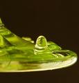
| 06/15/2003 04:40:12 PM |
Gloopby hawkidaComment by mcrochip: *Critique Club*
FIRST IMPRESSION: Looks like a frog. I like the contrast with the solid black background, and the light reflections on the gloop.
CHALLENGE: It's liquid, and it's not water, so the challenge is met.
COMPOSITION: The framing, with the leading edge of the liquid not touching the side, gives a feeling of movement. Again, the lighting here is very well done, with good reflections and no real hot spots.
TECHNICAL: I'm assuming macro was used here, and that's most likely a good part of why it came out with the level of gloop detail. However, the edges are a bit fuzzier than I'd like to see them, especially visible in the front of the gloop.
CONCLUSION: A good interpretation of the challenge, well shot and executed. The depth of field/focus issue may be difficult to address in macro photography, if that's the mode used for this shot, but the detail and lighting make this a very nice shot.
Thanks for sharing and good luck in future challenges! |
| Photographer found comment helpful. |
| 06/14/2003 06:32:41 PM |
Time Out : Londonby hawkidaComment by buck4free: Photo is too busy in the background. Need to isolate the main subject more by using a shallower depth of field to blurr the background or rearranging the composition. |
| Photographer found comment helpful. |
| 06/13/2003 08:24:42 AM |
Time Out : Londonby hawkidaComment by gaja_tz: nice composition, I like blur on his hand, it showing some moving. nice colors. but people in the back looks like they are not there because they look to the totally different side. = 6 |
| Photographer found comment helpful. |
| 06/12/2003 12:06:54 PM |
Time Out : Londonby hawkidaComment by Kavey: I like the main subject and the composition as well as the hustle bustle behind him, though, for me, I think it would work better using a wide aperture to throw the people and background behind out of focus. |
| Photographer found comment helpful. |
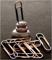
| 06/12/2003 04:36:19 AM |
Clip Artby hawkidaComment by inspzil: This looks just a little soft at the one sticking into ?? It looks a lot soft at the ones in front of that. |
| 06/11/2003 11:53:32 PM |
Clip Artby hawkidaComment by mcrochip: Definitely meets the challenge, and in very nice fashion. The title, however, is quite pun-ishing. The lighting is a bit weird to me - i can't quite put my finger on it, but it may be that I'm used to silver paper clips, and either the lighting or clips themselves are bronze/copper colored. I see also that you took the time to connect all of these clips. |
| Photographer found comment helpful. |
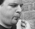
| 06/11/2003 09:14:27 PM |
Whistlerby hawkidaComment by OneSweetSin: *Critiqe Club*
This is a nice clean image. The focus is good, the texture is very good in the fact that you can actually see the pores in his face. The DOF is also very good.
One thing in this that could easily be corrected is since the challenge was sound show more of the whistle. The other thing is there are some round markings on the brick in the background and they make a backward L shape and kind of seem to create something growing out the side of the nose, slight repositioning would correct that.
In all it is a really nice image just is a little week for sound but it does meet the challenge.
|
| Photographer found comment helpful. |
Home -
Challenges -
Community -
League -
Photos -
Cameras -
Lenses -
Learn -
Help -
Terms of Use -
Privacy -
Top ^
DPChallenge, and website content and design, Copyright © 2001-2026 Challenging Technologies, LLC.
All digital photo copyrights belong to the photographers and may not be used without permission.
Current Server Time: 07/15/2026 01:55:27 PM EDT.