| Image |
Comment |
| 08/05/2003 06:00:44 PM |
HM: Light and Shadowby eloiseComment by rickhd13: i can see how this fits the challenge, the composition is good, and the coloring and light are good, however as a photo i just don't find it overly interesting to look at |
 Photographer found comment helpful. Photographer found comment helpful. |
| 08/05/2003 03:23:46 PM |
|
| 08/04/2003 12:16:27 AM |
|
| 08/02/2003 04:36:29 PM |
HM: Light and Shadowby eloiseComment by Konador: This photo doesnt look interesting to me at all. It needs some post processing to stop the colours looking so flat and dull, maybe increasing the contrast. Its also a bit blurry, and really the subject matter isnt very appealing. Also, the composition is too centered imo, and the angle isnt very creative or interesting either. |
| Photographer found comment helpful. |
| 07/30/2003 08:53:00 PM |
HM: Art Deco in architecture and decorationby eloiseComment by frisca: Eloise,
I noticed that you predicted a few of the most "common" comments. I am curious then, why you didn't share why you chose this shot, with these colours from this angle?
I am not fond of the angle, I don't think its adding anything to the picture, the colours are indeed very washed out without enough contrast and I don't see why the doors were included. You could have gotten a much more abstractly "art deco" feel from the photo if you had just included the windows (and the wings, but I don't feel those are particularly "art deco", because I usually think of clean lines and weird angles when I think of art deco)
Just a few of me "hit me" thoughts! I hope they help.
|
| 07/30/2003 05:31:00 PM |
|
| 07/30/2003 12:45:23 PM |
|
| 07/30/2003 11:42:00 AM |
|
| 07/30/2003 10:08:56 AM |
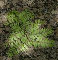
HM: Light and Shadowby eloiseComment by SatelliteSpeck: i think that by making this a black and white photo with high contrast, you could not only emphasize the light and shadows aspect, but also the texture of the tiny leaves... i tried it in photoshop, and it came out lovely! - 6 |
| 07/28/2003 08:19:22 PM |
|
Home -
Challenges -
Community -
League -
Photos -
Cameras -
Lenses -
Learn -
Help -
Terms of Use -
Privacy -
Top ^
DPChallenge, and website content and design, Copyright © 2001-2026 Challenging Technologies, LLC.
All digital photo copyrights belong to the photographers and may not be used without permission.
Current Server Time: 07/26/2026 12:45:29 PM EDT.