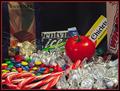
Stranger in Candy Landby
karmatComment by Azrifel: ~~~~Critique Club Comment~~~~
Composition (content)
I think this is too "set up", the big black hole between the "Squares" and the "Chicklets" gives it away too much. Another angle, more from above might have given a better, more complete, less obvious view. The shelf suggestion of Indigo is a good one. Another interesting idea is to put it in a sea of M&M's and paint a M&M logo on the tomato. The red M&M color almost matches the tomato's.
The "Kisses" produced a lot of nasty glare and are very dominant in the image.
Good lighting, no nasty shadows.
Background
See composition.
Camera Work (Technical)
Good exposure, but the foreground is a bit soft. Was this from close by? If so, try to stand back and zoom in to create a larger field of focus (increase the DOF at F8). The focus is good.
Digital Processing (technical)
It looks a bit oversharpend to me, a lot of jaggies around the curves of the M&M's and all the letters on the packages in the background. Colors are very good.
The jpeg quality can be a level higher as you have some room for a higher filesize. Stronger compression enhances the sharpening jaggies.
My opinion
The concept has some interesting potential, but as it shows too much that it is a setup. I don't have problems with setups.