Brahm's Lullabyby
karmatComment by Manic: Critique Club Comment :o)
Composition:
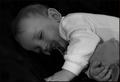
Photographing a child is obviously quite tricky, since there is little that you can do to get them exactly how you want - catching them while they're asleep is probably as good a time as any ;o) It's a pity that your crop wasn't a touch taller, since you've missed off the end of the child's left hand. In addition, a slight change of camera position, more up and to the right, could have positioned that left hand more on the same vertical line as the child's eyes, plus the line of the arm would have lead the viewer's eye across the shot nicely. As its currently positioned, it doesn't do this as well as it could. I'd also suggest that you try flipping the shot left<->right, as ths can sometimes help lead the eye from the topleft corner (the natural start point) into the image.
Background:
The solid black background means that the child is the only point of interest in the shot, and provides a reasonable contrast. However, the lack of texture to the surface makes it hard to work out where exactly the child is asleep - on a bed? the sofa? the floor? or whereever, so there is a slight lack of context there.
Camera Work:
The focus is a touch soft, but that can be expected from such a long exposure, especially with an "unwilling" model :o) Perhaps increasing the lighting (or using a lighter background) would help reduce the shutter time, and thus retain the details of the shot a bit more.
Post Processing:
I'd be curious to see what this photo looked like in colour, since you've obviously made the choice of going for b&w here. The lack of colour means that the eye is drawn to the lighter areas of the photo first, which in this case is the clothing, and the dark background merges into the child's hair a bit, which is unfortunate. That said, the fleshtones are good, and the slight lack of focus works for you, since portraits tend not to be in super-crisp detail :o)
Your choice of a slight black border doesn't assist this photo greatly, since it only affects the lefthand side of the shot - perhaps a single pixel border of white in between the main body and the black border would work, but I'll leave that to you to play around with.
One quick note on your crop - you've not used the maximum 640 pixels on either of your dimensions, so your photo could have been a little bit larger, thus could have shown a bit more detail, or a bit more of the child.
My Opinion:
Its a photo of a child, something I'm not overly keen on in general on DPC, since many parents consider a snapshot of their child doing anything "cute" would make the shot a surefire winner (in their mind). However, in this case, you've created an appealing photo without falling into this trap, and I'd rate this as definitely an above average shot. As for meeting the challenge, in this challenge using the title to sell a photo was pretty much mandatory, and your choice works well.
If you have any questions about any of this critique, please feel free to contact me via the DPC Fanatics chatroom or via the PM system.