| Image |
Comment |
| 03/11/2009 12:52:59 AM |
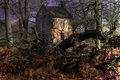
The Little House...by TonyUKComment by L2: Very spooky, but the most awesome of ways. This reminds me of another shot from the 100 Years challenge. :) 9 |
 Photographer found comment helpful. Photographer found comment helpful. |
| 01/09/2009 06:31:50 PM |
|
| Photographer found comment helpful. |
| 01/09/2009 02:20:37 PM |
|
| Photographer found comment helpful. |
| 12/16/2008 11:20:31 AM |
|
| Photographer found comment helpful. |
| 12/13/2008 02:38:10 PM |
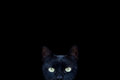
Tedby TonyUKComment by macrothing: Oh, I like this. Nice clarity. Excellent focus. Maybe just cloning out that tiny speck above Ted's head. edit:typoMessage edited by author 2008-12-15 06:20:29. |
| Photographer found comment helpful. |
| 12/01/2008 10:51:23 AM |
Mizzby TonyUKComment by TonyUK: Bowens Gemini 500's
1 huge soft box and a second fill light
Black paper backdrop
Cheers |
| 12/01/2008 06:57:40 AM |
Mizzby TonyUKComment by jarjar: Hi Great photograph
What background and lighting system do you use
Thanks
john |
| 09/16/2008 06:42:53 PM |
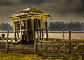
The Old Ferry Ticket Office Liverpoolby TonyUKComment by vxpra: First, let me thank you for putting information into your comments section. That is always nice- and something I should do more of.
I like the image overall. Very moody. The leaning of the building pulls my eyes immediately to the left and out of the frame. You have a fair amount of repitition (sp?) on your trees. I can pick the same top out six times. A bit of a halo around the building. The processing is very nice and well thought out. Many times I'll sit down to edit a shot and have no idea where I am going and usually get frustrated, other times I know right away. This is well put togther so I am thinking you had a pretty firm idea what you wanted it to look like. Nice work. |
| Photographer found comment helpful. |
| 08/31/2008 05:37:13 PM |
The Old Ferry Ticket Office Liverpoolby TonyUKComment by MikeJ: I think it's a pretty good image. One thing that I noticed though is the shack is leaning out of the picture or towards the short cropped side. This causes my eyes to follow the lean and right off the edge of the image. Had you been able to lean it towards the left where you have lots of image room, it would have worked better. Or don't crop it so tight on the left side and crop a bit more off the right side (say just to the right of the post. The post is a good framing element).
Just my opinion of course.
Mike |
| Photographer found comment helpful. |
| 08/31/2008 05:17:35 PM |
The Old Ferry Ticket Office Liverpoolby TonyUKComment by briantammy: i like the composition here and the sharpness. this looks like hdr (i know you said it's not) but the dodge and burning looks a bit overdone. My personal taste is that if i can tell it's been done then it's overdone. especially noticeable are the trees behind the building. overall though i think this is a very nice dramatic image. |
| Photographer found comment helpful. |
Home -
Challenges -
Community -
League -
Photos -
Cameras -
Lenses -
Learn -
Help -
Terms of Use -
Privacy -
Top ^
DPChallenge, and website content and design, Copyright © 2001-2026 Challenging Technologies, LLC.
All digital photo copyrights belong to the photographers and may not be used without permission.
Current Server Time: 07/16/2026 01:41:35 AM EDT.