| Author | Thread |
|
|
10/15/2009 04:47:38 PM |
|
Nice photo but designers usually like less filtered images so that they can do the sharpening and apply the effects. |
|
 Photographer found comment helpful. Photographer found comment helpful. |
|
|
09/16/2008 06:42:53 PM |
First, let me thank you for putting information into your comments section. That is always nice- and something I should do more of.
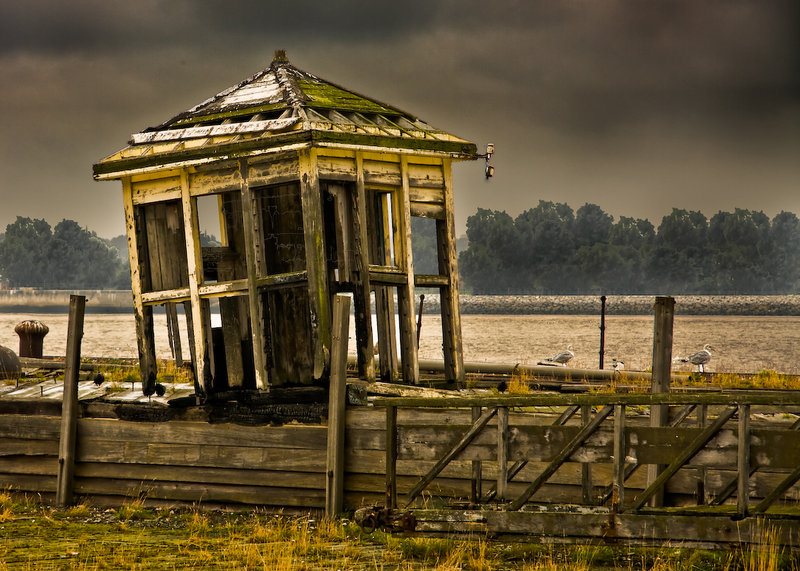
I like the image overall. Very moody. The leaning of the building pulls my eyes immediately to the left and out of the frame. You have a fair amount of repitition (sp?) on your trees. I can pick the same top out six times. A bit of a halo around the building. The processing is very nice and well thought out. Many times I'll sit down to edit a shot and have no idea where I am going and usually get frustrated, other times I know right away. This is well put togther so I am thinking you had a pretty firm idea what you wanted it to look like. Nice work. |
|
| Photographer found comment helpful. |
|
|
08/31/2008 05:37:13 PM |
I think it's a pretty good image. One thing that I noticed though is the shack is leaning out of the picture or towards the short cropped side. This causes my eyes to follow the lean and right off the edge of the image. Had you been able to lean it towards the left where you have lots of image room, it would have worked better. Or don't crop it so tight on the left side and crop a bit more off the right side (say just to the right of the post. The post is a good framing element).
Just my opinion of course.
Mike |
|
| Photographer found comment helpful. |
|
|
08/31/2008 05:17:35 PM |
|
i like the composition here and the sharpness. this looks like hdr (i know you said it's not) but the dodge and burning looks a bit overdone. My personal taste is that if i can tell it's been done then it's overdone. especially noticeable are the trees behind the building. overall though i think this is a very nice dramatic image. |
|
| Photographer found comment helpful. |
Home -
Challenges -
Community -
League -
Photos -
Cameras -
Lenses -
Learn -
Help -
Terms of Use -
Privacy -
Top ^
DPChallenge, and website content and design, Copyright © 2001-2026 Challenging Technologies, LLC.
All digital photo copyrights belong to the photographers and may not be used without permission.
Current Server Time: 06/24/2026 04:39:46 PM EDT.