| Image |
Comment |
| 11/15/2007 05:23:37 PM |
|
 Photographer found comment helpful. Photographer found comment helpful. |
| 11/15/2007 08:41:13 AM |
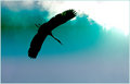
day 5 silhouetteby fotofanComment by Jutilda: I like the stark contrast of the bird against the sky. Looks like it's through a window with a gradient tint. ;~D I like the diagonal line created in one direction by his wings spread and the other direction by the edge of the clouds. |
| Photographer found comment helpful. |
| 11/15/2007 06:22:51 AM |
day 5 silhouetteby fotofanComment by bassbone: A very dramatic sihouette - this crane looks so regal and elegant in this shot. THe placement in the upper left, providing a place for it to fly is very well done. The starkness of the color contrast also is a highlight.
Sour - I see a bit of haloing around the head of the bird. Also, there seems to be a peculiar green line of color right around the bird (it runs from the edge of the image through the legs and past the bird to the right). |
| Photographer found comment helpful. |
| 11/15/2007 01:27:32 AM |
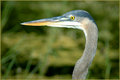
Zen of Blurby fotofanComment by jschro: Bokeh is supposed to enhance the image, here I feel it just gets in the way of the bird. Also the beak is a bit too close to the edge of the frame. |
| Photographer found comment helpful. |
| 11/14/2007 12:47:46 AM |
|
| Photographer found comment helpful. |
| 11/13/2007 07:19:11 PM |
day 3 A Day at the Parkby fotofanComment by bassbone: i like the use of controlled dof to highlight the birds head. The vast majority of the image is right on the money from an exposure standpoint, except for that ever so small amount of white under its chin.
I think you could even go further to blur the background - the grasses still seem to distract a bit and using a blur tool might even add more distinction |
| Photographer found comment helpful. |
| 11/13/2007 07:07:59 PM |
day 4 My daughter Amyby fotofanComment by bassbone: love the look she has - very nice soft lighting and good control of focus. I think the selective desaturation really detracts here - pick either color or b/w. It is too good an image to get cute-sy. |
| Photographer found comment helpful. |
| 11/12/2007 07:38:19 PM |
day 3 A Day at the Parkby fotofanComment by carofo: I love herons. Those are birds with CLASS!
You did a very good job of catching a classic heron pose against a great "bokehed" BG. The eye is especially sharp and striking.
On the sour side... ummm, can't really think of anything. The composition is right on... If I was picky, picky, I guess I'd wish for side lighting that would provide more contrast and texture in the feathers? But that's really pushing it.
Wonderful picture! |
| Photographer found comment helpful. |
| 11/12/2007 12:43:03 PM |
day 2 FIVE to enterby fotofanComment by carofo: Great picture! Love the DOF and how you chose to position the game pieces in the back so that we can still identify the parchesi game even without reading your comment. Did you have to glue them for it to hold on top like this? Very good idea for this challenge theme (yes, it is ENVY seeping through!!)
Sour comment: as others have side, white balance is on the warm side. But it still doesn't take anything out of this picture.
Man, I wish I had thought of that :) |
| Photographer found comment helpful. |
| 11/12/2007 12:21:41 PM |
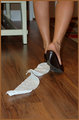
day 1 I hate when that happensby fotofanComment by carofo: Sweet: I like that you selected the toilet paper as your point of focus. The DOF and the lighting are both good.
Sour: I would have moved the chair. Not only is its place in the picture distracting, but the white color really calls attention to it vs the muted colors of the rest of the image.
Nice beginning! |
| Photographer found comment helpful. |
Home -
Challenges -
Community -
League -
Photos -
Cameras -
Lenses -
Learn -
Help -
Terms of Use -
Privacy -
Top ^
DPChallenge, and website content and design, Copyright © 2001-2026 Challenging Technologies, LLC.
All digital photo copyrights belong to the photographers and may not be used without permission.
Current Server Time: 06/10/2026 11:01:08 PM EDT.