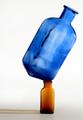
Balanced Imbalanceby
adineComment by train: Hello Adine from the Critque Club
First of all Congratulations on your placing with this image
I just love the blue bottle and it is very nicely done but for my own preference I do not like the brown bottle it has little interest maybe a green one would look better but thats just being very picky
The blue bottle almost looks like its been painted onto a canvas and could almost give the same impact without the smaller bottle
I am not very technical but I can see this is good and very nicely done
Maybe the white background is a little stark or harsh Dark blue maybe would look nice
But other than that I dont really feel I can add a lot more Nice idea well taken
Just keep on enjoying your photography and enjoy D P C I find it very addictive!
I hope my comments although very limited help
If you have any questions feel free to P M me
Regards
Sally