| Image |
Comment |
| 12/11/2003 02:05:45 AM |
|
| 12/10/2003 04:57:09 PM |
Ornament Iby shareinncComment by vadvirag: Crop is too tight on the bottom (I should have left even distance on the left and bottom), and lighting spot is a bit distracting in the background. Otherwise I love the colours, DOF and softness here. |
| 12/10/2003 06:49:35 AM |
|
| 12/10/2003 01:25:49 AM |
Champagneby shareinncComment by neenee1999: Beautiful shot, love the colors, the upward lighting works very well with this shot, I think the garland at the bottom adds just enough sparkle to give it a more festive mood. good job 10 |
| 12/09/2003 12:50:18 AM |
|
| 12/08/2003 08:57:11 AM |
Soft Christmas Lightsby shareinncComment by pcody: Man. That is sad. I didn't vote or comment on this challenge.
If I had, I would have said it was a bit too dark and the highlight on the bulb is blown out.The ornament in the upper left takes up too much of the area and takes away from the composition. The two lights are attractive and the composition might have been more pleasing if you had composed them more within the frame and also tilted the camera to get them to look slightly more upright.I do like the mood but it doesn't look soft focused. With a little more work, I think this could be a wonderful christmas card. but that's only my opinion.
Edit: congrats on the new camera, and happy shooting. Message edited by author 2003-12-08 08:59:45. |
| 12/08/2003 08:10:58 AM |
|
| 11/30/2003 11:56:35 AM |
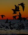
Soar IIby shareinncComment by Neil: An interesting shot; I would have liked to see the crop of just the birds sillouetted against the sky. The color contrast there is very cool, though perhaps a bit too dark a levels job here.
However, I am not sure I see the connection to the challenge here. |
| 11/30/2003 11:33:51 AM |
Soar IIby shareinncComment by Firstrich1: When a flock of birds are spooked! nice idea, I almost missed the angle on this one. the colors add so much to the mood of this shot...wonderful sun set. good luck! |
| 11/29/2003 12:06:08 PM |
Soar IIby shareinncComment by magnus: Great use of color and silhoutte. The water surface looks strange (over-saturated?), but I'm not sure how you'd fix that without spot-editing. Connection to this challenge is subtle to say the least, but the photo certainly deserves to be seen. |
Home -
Challenges -
Community -
League -
Photos -
Cameras -
Lenses -
Learn -
Help -
Terms of Use -
Privacy -
Top ^
DPChallenge, and website content and design, Copyright © 2001-2026 Challenging Technologies, LLC.
All digital photo copyrights belong to the photographers and may not be used without permission.
Current Server Time: 07/17/2026 12:31:44 AM EDT.