Morning Serviceby
heavyjComment by ambaker: Critique Club Review:
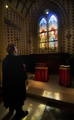
Color, Saturation, and Hue: Colors are good, Saturation is appropriate for this subject, and Hues are realistic.
Brightness and contrast: Image could be a little brighter, the area above and around the window is a little dark for me, which brings the image down a bit. If the brightness were adjusted, likely contrast would have to be also, to keep the highlights from burning out.
Focus and depth of field: Overall focus appears to be a tiny bit soft. Nothing really bad, but I would think it would be a little sharper with this camera/lens combo. Depth of field is excellent.
The image appears to lean a bit to the left. The vertical architectural detail on the left border of the image, and the surface of the altar, and the stained glass windows themselves, all appear to slope a bit downwards to the left. The other thing that may have hurt you a bit is that this image involves the dreaded R word. (Religion) If an image has much to do with western religions, some will vote them lower. (Intersting that this was taken in Japan. Had this been an image in a Buddhist temple, you might have gotten a little higher score. Others are offended by any religion.)
I like the saturation on the statined glass. The is just a bit of washout at the top of the right hand window. I also like the way you have captured the light on the floor.
Nice job of posing the subject. The light on his face works really well. Shows this is a thoughtful piece, not a simple snapshot. Though, as I look I think you may have tried for too much in one image. To fit whole window and all of him in, and both in focus, there is so much there that neither is dominant, neither is large enough to get all the interesting detail in there.
Overall, I like the richness of the color throughout. Nice work.