| Image |
Comment |
| 11/17/2003 05:14:30 PM |
|
| 11/17/2003 01:28:32 PM |
|
| 11/17/2003 11:14:46 AM |
|
| 11/17/2003 09:43:12 AM |
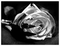
A rose between two thornsby jonpinkComment by sonnyh: I liked the idea of this literalism but thought it would have portrayed that better if the rose was actually between 2 thorns. The silver from the fork with it's reflection is kind of distracting. |
| 11/16/2003 11:58:58 PM |
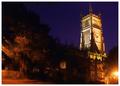
Cirencester Churchby jonpinkComment by Neuferland: This is a great shot of a building on the right but the trees on the left hurt this shot to me. Also the bright light on the right is very distracting to me. A 5 |
| 11/14/2003 04:22:11 PM |
|
| 11/14/2003 11:09:30 AM |
|
| 11/13/2003 11:28:18 PM |
Trick....or Treat....by jonpinkComment by karmat: CRITIQUE CLUB CRITIQUE
by karmat
Compositionally, I like the balance between the pumpkin and the model. I also like the background "surrounding" them, as it gives the feeling that they are being "swallowed" into the picture. The pink scarf also helps to differentiate the pumpkin from your model, and adds some color to the shot.
I think if the focus on the pumpkin had been sharper, it would have had more punch. Also, like someone mentioned, since you "distorted" her face, it may have been a nice touch to distort the pumpkins as well. I think using that same effect on the opposite side of the pumpkin would work well. That said, the effect does little to endear me to the picture. I think it would have been as strong, if not stronger with that effect added.
If you have any questions or comments, please feel free to contact me.
karmat |
| 11/13/2003 09:07:24 PM |
|
| 11/13/2003 04:25:49 AM |
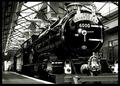
The Railway Children by Edith Nesbitby jonpinkComment by Kavey: A lovely picture with wonderful leading lines - I like how it all seems to come forth from the lower left corner. I can't help thinking it would tie in better were there a couple of kids on the platform - even if they were reasonably far back along the platform. Focus seems a touch soft? |
Home -
Challenges -
Community -
League -
Photos -
Cameras -
Lenses -
Learn -
Help -
Terms of Use -
Privacy -
Top ^
DPChallenge, and website content and design, Copyright © 2001-2026 Challenging Technologies, LLC.
All digital photo copyrights belong to the photographers and may not be used without permission.
Current Server Time: 07/16/2026 09:26:22 PM EDT.