| Image |
Comment |
| 09/12/2007 07:06:48 PM |
|
 Photographer found comment helpful. Photographer found comment helpful. |
| 09/12/2007 06:45:19 PM |
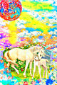
unicorn2.jpgby mkComment by Art Roflmao: While I REALLY like this - I mean cuz of the cute unicorns & all - I am thinking it would look better in black & white or sepia and with vicious fighting dogs (from the NFL maybe) instead of the unicorns, and maybe instead of flowers there would be um, oh... flames! Yeah, flames! But then I would want it in color. Ok that's it. Desat everything, replace the unicorns with pit bulls and then add bright reddish orange flames! Then I'll fave it!
No seriously just those few changes I mentioned and this would be friggin awesome!
edit to add: Your use of tonemapping here is astonishing. Shockingly astonishing. :) Message edited by author 2007-09-12 18:46:52. |
| Photographer found comment helpful. |
| 09/12/2007 01:07:15 PM |
|
| Photographer found comment helpful. |
| 09/12/2007 12:55:55 PM |
|
| Photographer found comment helpful. |
| 09/10/2007 05:00:15 AM |
|
| Photographer found comment helpful. |
| 09/06/2007 08:41:30 AM |
fs outtakeby mkComment by scalvert: Great portrait- very well done. It's so good to see you actively shooting again. ;-) |
| Photographer found comment helpful. |
| 09/03/2007 03:20:25 PM |
|
| Photographer found comment helpful. |
| 09/03/2007 01:24:00 PM |
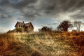
house.jpgby mkComment by pcody: yanko, I believe you assumed I liked this version better because I asked why she entered the other. Not the case at all and I never said anything like that. The reason I asked about the other is because the clouds in that one seemed more unnatural. But you are right, each to their own. I do like the house better in this one.
mk, you can hide this if you want. I just didn't like someone using my comment to state their biases. |
| Photographer found comment helpful. |
| 09/03/2007 11:39:41 AM |
house.jpgby mkComment by mk: Originally posted by yanko:
Why do you prefer this version? No offense to the great Mysterious Yellow 70 but this edit kind of looks like she just punch in some random settings to produce this tonemapping. The tonal relationships are completely destroyed making the photo look like a mess.
The other version (i.e. take III.jpg) is a much finer edit hands down. The highlights and shadows while still looking tonemapped is still believable. The light still looks like it's coming from the sun where as in this photo it looks like the weeds are radioactive emitting their own light. It just floors me that people love these crazy edits but hey to each is own.
Also, don't kill me! *runs* |
You're exactly right. This version was a simple tonemap of the disaster that was the original entry (good god!) as a test when I first got the plugin. It was only done on a 640px image. I had to redo in order to make a print res version and the other is what I came up with.
At this point, I think I'm probably done editing this silly pic. Time to do some new stuff. :)
|
| 09/03/2007 06:23:35 AM |
house.jpgby mkComment by yanko: Originally posted by pcody:
to bad it didn't get accepted. But I saw the picture you posted as the winner last year...and, well...enough said. Their loss.
Can I ask why you decided on a softer version?
This is the MN fair? Next year I swear I'm going to send something in. Especially seeing that picture that won.
If you want I'll erase this comment. Don't want to mess up your presentation. |
Why do you prefer this version? No offense to the great Mysterious Yellow 70 but this edit kind of looks like she just punch in some random settings to produce this tonemapping. The tonal relationships are completely destroyed making the photo look like a mess.
The other version (i.e. take III.jpg) is a much finer edit hands down. The highlights and shadows while still looking tonemapped is still believable. The light still looks like it's coming from the sun where as in this photo it looks like the weeds are radioactive emitting their own light. It just floors me that people love these crazy edits but hey to each is own.
Also, don't kill me! *runs* Message edited by author 2007-09-03 06:26:22. |
| Photographer found comment helpful. |
Home -
Challenges -
Community -
League -
Photos -
Cameras -
Lenses -
Learn -
Help -
Terms of Use -
Privacy -
Top ^
DPChallenge, and website content and design, Copyright © 2001-2026 Challenging Technologies, LLC.
All digital photo copyrights belong to the photographers and may not be used without permission.
Current Server Time: 07/19/2026 12:22:25 AM EDT.