| Image |
Comment |
| 12/17/2008 08:03:49 PM |
|
 Photographer found comment helpful. Photographer found comment helpful. |
| 12/13/2008 04:05:05 PM |
|
| 12/12/2008 08:16:11 PM |
Winter... stage leftby Pipe_DreamComment by aliqui: I'm currently going through a vignette fascination, so I may have tried the same approach with this edit. However, looking at it as someone who didn't do the edit, I think in this instance it would have been better to not use one. She's out in the wilderness, but the vignette seems to make it feel cramped.
Similar to the unspoken rule of color vs temperature. Reds are associated with warmth and blues with cold, so you don't generally want a winter scene with a red hue. Unless the mood you're going for is cramped or constrained, I'd say there's probably a similar rule to not use vignettes when out in the vast wilderness.
The subject in this case will draw attention to herself thanks to your flash illuminating her. There's not really a need to use the vignette to direct the viewer. |
| Photographer found comment helpful. |
| 12/12/2008 12:07:50 AM |
Winter... stage leftby Pipe_DreamComment by bob350: The muted puples,pinks, and blues of the sky and water might convey the challenge topic better without the person. Bright white jacket/vest and lighting of the ground and far side of the person make it more difficult to sit back and enjoy the natural setting for itself (realizing that many would find it uninteresting without the person). |
| Photographer found comment helpful. |
| 12/11/2008 09:27:14 PM |
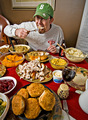
Num Num Yummyby Pipe_DreamComment by De Sousa: Funny and original shot. If you ever need help for all of that food, just call me. It looks tasty. Great image! |
| Photographer found comment helpful. |
| 12/10/2008 06:05:00 PM |
Winter... stage leftby Pipe_DreamComment by Ja-9: something here doesn't look right...like the person was "lifted" into the picture...her coat is to light, yet there doesn't apprear to be a light source, otherwise the sunset looks soft or rather "late" |
| Photographer found comment helpful. |
| 12/10/2008 01:08:02 AM |
Num Num Yummyby Pipe_DreamComment by salmiakki: Greetings from the Critique Club
First of all well done on 11th place.
My first impression of this pic is that it is very busy. I personally found it had too many things to look at and this made it hard to look at.
So, from a compositional point of view, I feel it would have worked better without so many things on the table. The random wine glass doesn't add much to the composition. If you had taken a step to the right, you may have avoided the white curtain and the pitcher that are creeping into the right frame. By doing that you would also have got more of the cello in the background which would, I think have worked well.
To me it looks like it is not really properly focused and that you have used the clarity slider a little bit too much to try to compensate when converting the file (via ACR). If you haven't done this, then I'm sorry, but this is what it looks like to me. I also am seeing a slight yellow colour cast in the image, but that may just be my monitor.
I think you should be pleased with the score you got. Others clearly disagree with my point of view, which is all this is. :)
Regards
Sarah
|
| Photographer found comment helpful. |
| 12/09/2008 03:47:43 PM |
|
| Photographer found comment helpful. |
| 12/08/2008 05:46:18 AM |
|
| Photographer found comment helpful. |
| 12/07/2008 09:30:05 PM |
|
| Photographer found comment helpful. |
Home -
Challenges -
Community -
League -
Photos -
Cameras -
Lenses -
Learn -
Help -
Terms of Use -
Privacy -
Top ^
DPChallenge, and website content and design, Copyright © 2001-2026 Challenging Technologies, LLC.
All digital photo copyrights belong to the photographers and may not be used without permission.
Current Server Time: 07/17/2026 06:46:10 PM EDT.