| Image |
Comment |
| 10/01/2007 10:26:17 AM |
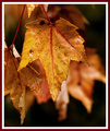
Autumn in New Englandby bassboneComment by Melethia: The texture is so well rendered I can feel it. Lovely. You may get some negative comments on the frame... I think frames are mostly a personal choice, but this one slightly detracts from the delicate nature of the detail in this shot. |
 Photographer found comment helpful. Photographer found comment helpful. |
| 10/01/2007 09:21:34 AM |
|
| Photographer found comment helpful. |
| 10/01/2007 09:10:03 AM |
Autumn in New Englandby bassboneComment by Jutilda: LOVE LOVE!!! I'd kill the wide border though - it's a touch distracting from those divine leaves. I'm such a fan of fall colors!!!! |
| Photographer found comment helpful. |
| 10/01/2007 08:26:05 AM |
|
| Photographer found comment helpful. |
| 10/01/2007 05:16:45 AM |
|
| Photographer found comment helpful. |
| 10/01/2007 03:51:14 AM |
Conservation of Angular Momentumby bassboneComment by jonfrommk: When I saw this picture of a gyroscope I slapped my head as I thought it represented the perfect depiction of stillness and motion in a single subject. Love the over exposed background. Definitely has a real print feel about it. Great shot and a great finish |
| Photographer found comment helpful. |
| 10/01/2007 01:14:27 AM |
|
| Photographer found comment helpful. |
| 10/01/2007 12:05:30 AM |
|
| Photographer found comment helpful. |
| 09/30/2007 09:20:41 PM |
Jog in the Fogby bassboneComment by TDubb: This is an amazing shot! I like so many things about it... the double yellow line, the shape of the fog, the light and dark. Wow! |
| Photographer found comment helpful. |
| 09/29/2007 11:45:55 PM |
|
| Photographer found comment helpful. |
Home -
Challenges -
Community -
League -
Photos -
Cameras -
Lenses -
Learn -
Help -
Terms of Use -
Privacy -
Top ^
DPChallenge, and website content and design, Copyright © 2001-2026 Challenging Technologies, LLC.
All digital photo copyrights belong to the photographers and may not be used without permission.
Current Server Time: 07/19/2026 11:02:46 AM EDT.