| Image |
Comment |
| 05/16/2007 11:07:12 PM |
|
 Photographer found comment helpful. Photographer found comment helpful. |
| 05/16/2007 11:02:13 PM |
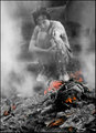
DAY 13. B&W. pat & the fire ...by rozComment by colorcarnival: roz this photo is just way cool. love the selective desat. And Pat faded in the background gives the whole thing this ethereal feel (if that is the right word.) Definitely not boring! |
| Photographer found comment helpful. |
| 05/16/2007 09:47:27 PM |
DAY 17.5. B&W. wheels reflected ..by rozComment by krnodil: Very neat perspective and all the reflective surfaces make for some very interesting shapes and contrasts in b/w. The one thing that bugs me is the bottom pair of wheels to the left of center are a bit murky-looking and that's right where my eye goes with the leading lines of the cars - it's a minor flaw to my mind, but thought I'd point it out in the spirit of constructive criticism. :) |
| Photographer found comment helpful. |
| 05/16/2007 09:23:09 PM |
DAY 17.5. B&W. wheels reflected ..by rozComment by Retroesque: I think not only is the photo fabulous but so are YOU for daring to ask!
I cannot believe you were asked to put your camera away, what were you going to do, take photos of all the pages and not buy the book? |
| Photographer found comment helpful. |
| 05/16/2007 07:44:01 PM |
|
| Photographer found comment helpful. |
| 05/16/2007 06:09:31 PM |
|
| Photographer found comment helpful. |
| 05/16/2007 05:55:23 PM |
|
| Photographer found comment helpful. |
| 05/16/2007 05:38:55 PM |
|
| Photographer found comment helpful. |
| 05/16/2007 05:38:37 PM |
DAY 17.5. B&W. wheels reflected ..by rozComment by SandyP: How cool!!!!!!! Something about this shot makes me think of Melethia. Like she would love it. I love all those sparkly reflections!
You are amazing, Roz! Most of us are scratching our heads by now wondering how we are going to come up with enough ideas to finish the 30 days off -- and here you are so overflowing with creativity that you post more than one on a day! You are "the bomb!!" :)
|
| Photographer found comment helpful. |
| 05/16/2007 05:17:35 PM |
|
| Photographer found comment helpful. |
Home -
Challenges -
Community -
League -
Photos -
Cameras -
Lenses -
Learn -
Help -
Terms of Use -
Privacy -
Top ^
DPChallenge, and website content and design, Copyright © 2001-2026 Challenging Technologies, LLC.
All digital photo copyrights belong to the photographers and may not be used without permission.
Current Server Time: 06/26/2026 07:57:20 AM EDT.