DPChallenge: A Digital Photography Contest You are not logged in. (log in or register
 
Browse Settings
Currently viewing:
Registered UserGordon

Show comments:

Per page:

Order:

Comments:


Comments Received by Gordon
Pages:   ... [255] [256] [257] [258] [259] [260] [261] ... [396]
Showing 2571 - 2580 of ~3960
Image Comment
Wind
04/15/2003 08:08:27 AM
Wind
by Gordon

Comment by crabappl3:
Very nice capture. As I look at it more, I think it's stronger than I first realized. The movement in the blades with the crispness of the tail and stand, really work well. This is now in my top 10 this week. -danny
Wind
04/15/2003 07:54:12 AM
Wind
by Gordon

Comment by jmsetzler:
excellent work... the motion of the windmill is perfect :) - setzler
Wind
04/14/2003 11:53:34 PM
Wind
by Gordon

Comment by dsidwell:
You capture not only the motion of the blades as they turn, but a dramatic emotion as well, due to the superb lighting and contrasts. Super work!
Wind
04/14/2003 11:12:02 PM
Wind
by Gordon

Comment by mzanoni:
Excellent windmill image.
Wind
04/14/2003 10:02:49 PM
Wind
by Gordon

Comment by moondoggie:
Great photo. Nice use of b/w (duotone?). Good composition. Nice border. Good feel and character to this image. Only knock is that the back of the sign is a bit washed out. Very well done!! 9 md
Blues and Greens
04/14/2003 06:01:29 PM
Blues and Greens
by Gordon

Comment by Gracious:
Hey Gordon, It's me back to comment again. Only this time for the CC.
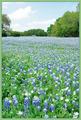
This composition is so nice. The perspective from which you shot it works very well to include the foreground. I like that you put the horizon in a good place rather than smack-dab in the middle.
The dof implies equal clarity of view throughout the picture. Even if the bg flowers aren't perfectly in focus, the foreground implies that it all is, and that works very well. Very well done.
The colors are beautiful and you've maintained a very natural palatte here. There is room for just a bit more saturation, without being overdone.
Exposure is fine except the sky looks slightly oe, but is acceptable. I think it would be improved with a bit more darkness. In other words it's a tiny bit too light. I think if it was a touch darker there would be a little more definition in the clouds. I know I'm being picky. I like it as it is too, but we are all here to learn and I like to be honest in my critique, and appreciate the same.
The border looks good. It doesn't compete with the image, but blends naturally.
Overall this is a wonderful, and pretty photograph of a beautiful scene.
Regards,

Grayce
Wind
04/14/2003 05:58:36 PM
Wind
by Gordon

Comment by NicNic101:
Very cool shot! Love the black and white!
Wind
04/14/2003 05:05:13 PM
Wind
by Gordon

Comment by bod:
A shame it's blacked out at the top, but it gives a great impression of a strong wind.
Nicely composed and I like the colour. Good focus/sharpness on the tail. Nice shot, well done.
Blues and Greens
04/14/2003 03:19:56 PM
Blues and Greens
by Gordon

Comment by marbo:
I can`t believe i was the only one to give a 10, this is a cracking shot for the colour challenge.
Wind
04/14/2003 02:32:31 PM
Wind
by Gordon

Comment by ursula:
Beautiful. I love it how the picture makes you feel the wind. -10
Pages:   ... [255] [256] [257] [258] [259] [260] [261] ... [396]
Showing 2571 - 2580 of ~3960


Home - Challenges - Community - League - Photos - Cameras - Lenses - Learn - Help - Terms of Use - Privacy - Top ^
DPChallenge, and website content and design, Copyright © 2001-2025 Challenging Technologies, LLC.
All digital photo copyrights belong to the photographers and may not be used without permission.
Current Server Time: 08/04/2025 08:18:43 PM EDT.