| Image |
Comment |
| 04/27/2005 05:04:01 AM |
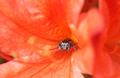
I'm watching you!by BeetleComment by bhowie: Well focused and the eyes are very appealling. I would suggest a tighter crop on the right, but I know that may be intentional given the challange. I also find the out of focus elements on the left off-putting - perhaps because they are right in the zone for thirds. Overall a solid entry. |
 Photographer found comment helpful. Photographer found comment helpful. |
| 04/26/2005 07:09:44 PM |
|
| Photographer found comment helpful. |
| 04/26/2005 05:49:31 PM |
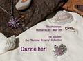
Summer Dreamsby BeetleComment by neophyte: great colors and very crisp. great tag lines but the comp is lacking. My eyes have to work to take in the ad. Remember " Less is more" |
| Photographer found comment helpful. |
| 04/26/2005 03:43:29 AM |
|
| Photographer found comment helpful. |
| 04/25/2005 05:59:32 PM |
Summer Dreamsby BeetleComment by RKT: To me it seems the picture was taken to frame the text, i think this may have worked better without the generic looking text. |
| Photographer found comment helpful. |
| 04/25/2005 05:20:48 PM |
Summer Dreamsby BeetleComment by Brad: A little bit "busy" in the composition overall in my opinion.
A different font and perhaps something less in the way of text like:
"Dazzle her this Mother's Day with our Summer Dreams Collection" may have faired better.
|
| Photographer found comment helpful. |
| 04/25/2005 03:29:35 PM |
|
| Photographer found comment helpful. |
| 04/25/2005 11:00:09 AM |
Summer Dreamsby BeetleComment by pcody: So far this is one of the best. The composition, clarity, concept and lighting are good. The only thing I can see that bothers me is the cut off stone by the necklace. It seems like it should have been either in or out of the picture. Just as a fyi. When you work with sand, take a paintbrush to feather around where you worked. |
| Photographer found comment helpful. |
| 04/25/2005 10:10:23 AM |
Summer Dreamsby BeetleComment by Di: Composition: excellent - well balanced
Lighting: the flares on the necklace and crab to my eye seem to be off slightly from where they micht be actually
Color: very good, would like to see better definition between the silver and pink
Clarity: very good - as jewelry is a lot different texture than the natural elements, it looks slightly out of focus.
Lettering: average - I would have liked to see a different font used
|
| Photographer found comment helpful. |
| 04/25/2005 04:31:59 AM |
Summer Dreamsby BeetleComment by Steveinnz: Nice layout. I think it would possibly work better with the jewels taking up twice the space they are at present. Would make a great advert. 7 |
| Photographer found comment helpful. |
Home -
Challenges -
Community -
League -
Photos -
Cameras -
Lenses -
Learn -
Help -
Terms of Use -
Privacy -
Top ^
DPChallenge, and website content and design, Copyright © 2001-2026 Challenging Technologies, LLC.
All digital photo copyrights belong to the photographers and may not be used without permission.
Current Server Time: 06/19/2026 03:48:14 PM EDT.