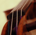
Stringsby
SiggavComment by theSaj: ::: Critique Club ::: [The Saj]
First Impressions: Ah...a violin
-------------------------------------------------------------
Composition: Composition leaves me a bit mixed. The DOF is so shallow that there is minimal detail to focus on. Further parts of the violin become mostly colored blurs.
Subject: The subject, "violin", is a beautiful instrument. However, I find the colored strings to be extremely distracting.
Technical (Colour, focus, and light): Color tones is nice. The focus leaves a bit to be desired. Lighting is well done.
-------------------------------------------------------------
To improve?: Increase the depth of field. Desaturates the magentas, reds, cyans to see if you can reduce the colors of the strings.
Summary: Not a bad endeavor but not very strong. As it was for the challenge "leading lines" I would have expected the lines to have been a stronger focus. Where as it stands now they are blurred and secondary to the photo.
-------------------------------------------------------------
It is my hope that these insights are helpful, and constructive. If you have any questions regarding this critique, please feel free to PM me. Also feel free to PM me with any feedback on this critique. And please remember to mark it "Helpful" if you found it so.
- Jason "The Saj"