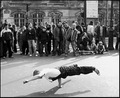
Reaching for the skyby
purpleflutterby13Comment by KaDi: Greetings (again) from the Critique Club! My first reaction on drawing this image from the CC pool was "Cool! I get to comment on an image I really like!" My second reaction? "Cool! It's another purpleflutterby13 shot!" :)
The first thing that strikes me about this image is its strong graphic quality. I love the way the spaces between the people create interesting shapes and invite the eye to explore the human forms. There is pleasing repetition in the mirroring of the arms holding up the man's legs and in the connection of this main figure to the hands he holds. The figures have such a nice variety of shape...there's a young girl, a guy with dreads....it's fun to try and relate to this diverse group and what they're doing.
I love the color and the way it fades to light across the image. It seems to give dimension to the flat silhouetted shapes.
Is it "contre-jour"? Well, yes the main light source is behind the individuals so, as far as I understand it, it is. In some of the other challenge images the light was stronger. Were this light stronger or slightly differently oriented you might have gained some rim lighting along one side of the figures. I think that would move the idea a bit further towards 3-dimensional space. That might or might not be a good thing--just something to play with to see if you like the effect.
This placed fairly well in the challenge. Still, I would have liked to have seen it place higher (since I voted it fairly high myself). I'm not sure what's holding it back. Maybe people don't find the bits of humans cut off by the frame pleasing? Maybe it feels too much like a graphic and not enough like a "photo"? (I'm guessing that might be where those 1's to 3's came from.)
Overall, this image has impact, style, story, pleasing lines and decent composition. Well done! (Now get those folks together and make them do it again. :-) )
--Kadi