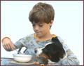
Breakfast for Twoby
OneSweetSinComment by jadin: Greetings from the Critque Club!
Composition:
While it is a very centered photo, there is enough going on to keep your interest. The real downfall is your background. It's just too much for the photo. An out of focus kitchen would seem more appropriate for this shot. And quite a bit more natural of course. After reading your comments I'm surprised you removed the kitten. I think "Breakfast for Three" would've made the photo that much more interesting, as well as 'cute' :)
Lighting:
I think your lighting is good. His face isn't hid in shadows, and your exposure is just fine. I think the real problem is the brightness of the background, you take that away and the photo looks a lot better.
Technical:
I think your photo is technically flawless, everything looks good as far as your technique is concerned.
Post-processing:
You might want to consider adding a touch of contrast to it. It is a touch on the flat side right now. Other than that it looks good.
Overall:
This is a great shot. I like it a lot. With a more appropriate background I think you would've scored higher. But even the best photos will get hit hard if the voter doesn't see it as fitting the challenge. As you said many will feel this was a snapshot, and they voted accordingly. I think people were really looking for the "Sunday at Sears" look. ;)
Hope your photos score more deservingly in the future.