| Image |
Comment |
| 05/30/2007 06:27:29 AM |
|
 Photographer found comment helpful. Photographer found comment helpful. |
| 04/17/2007 12:27:52 PM |
|
| 04/17/2007 12:27:02 PM |
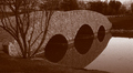
Old Bridgeby santiago9erComment by Haneck: Well....first of all it looks a bit too dark. Secondly, the sepia tone seems to be taking over. Areas that should be black (such as the shadows under the bridge) are actually brownish. Perhaps the white-balance is off? I'm not sure. It could probably be fixed in photoshop... But other than that, this looks like a really beautiful image! I like the fact that you used the sepia tone (even if it didn't turn out :)) The composition and the reflections are really beautiful! Keep up the good work!:) |
| 04/03/2007 09:22:05 AM |
|
| Photographer found comment helpful. |
| 03/21/2007 09:32:21 PM |
Old Bridgeby santiago9erComment by emorgan49: I wonder if you suffered from "voter monitor calibration syndrome" It seems a bit dark on my monitor. Darkish images appear too dark on a lot of other monitors and suffer for it. When id doubt, enter a brighter shot or be prepared for a lower score.
You have a dramatic leading ling here, the surface where the bridge and reflection meet, and the decreasing size of the ovals they make. But you line leads the viewer to nothing. Are those birds on the opposite shore? I can't make it out. So, in a speed vote, if your leading line leads the viewer to nothing, his sye continues on out of the frame and his finger says "Next" without giving the rest of the photo the attention it might deserve. |
| Photographer found comment helpful. |
| 03/21/2007 08:45:25 PM |
Old Bridgeby santiago9erComment by jfwolpert: i thot it was a bit flat, not real contrast. and my eye doesnt flow to anywhere in the frame. keep pushing it! |
| Photographer found comment helpful. |
| 03/21/2007 07:00:20 PM |
Old Bridgeby santiago9erComment by bassbone: I think this could have come off more dramatic (and that is what scores well here) with a better lighting on the bridge itself. There was decent contrast in the image - especially on the reflection, but the majority of the image seemed a little flat. In addition, the cropping was a little tight - I think more sky in the image may have helped as well. |
| Photographer found comment helpful. |
| 03/15/2007 07:29:14 AM |
|
| Photographer found comment helpful. |
| 03/14/2007 01:35:44 PM |
|
| Photographer found comment helpful. |
| 03/13/2007 03:38:45 PM |
|
Home -
Challenges -
Community -
League -
Photos -
Cameras -
Lenses -
Learn -
Help -
Terms of Use -
Privacy -
Top ^
DPChallenge, and website content and design, Copyright © 2001-2026 Challenging Technologies, LLC.
All digital photo copyrights belong to the photographers and may not be used without permission.
Current Server Time: 07/16/2026 06:03:59 AM EDT.