DPChallenge: A Digital Photography Contest You are not logged in. (log in or register
 
Browse Settings
Currently viewing:
Registered UserEssAreDubya

Show comments:

Per page:

Order:

Comments:


Comments Received by EssAreDubya
Pages:   ... [119] [120] [121] [122] [123] [124] [125] ... [142]
Showing 1211 - 1220 of ~1415
Image Comment
Fire Hazard
10/03/2006 07:19:23 AM
Fire Hazard
by EssAreDubya

Comment by atupdate:
Hello from the Critique Club,

Technicals: The exposure of this image is exceptional. I would have never guessed that so much detail could be captured shooting straight into a light bulb. Although the cropping of this image puts the main subject dead center, I think it works for this image. The reason being is that my eye knows there is more to the lamp then what is visible and it automatically draws in an outline of what might be there. Sort of like an implied leading line for the lamp.

Voter Appeal: The humor here is very good but just a bit subtle for the general DPC voter. I think your score suffered just a bit as any voter that didn't take the time to read everything in this image would have scored it as average or lower for being just a lamp. To be truthful, my eye was first drawn to the 120 V part of the light bulb and I had to search quite a bit to find the 75 W part of the image.

This image connects with me humor wise and I thank you for bringing a smile to my face.

Feel free to PM me if you have any questions regarding this critique.

Tim
Photographer found comment helpful.
Slip Me A Mickey
10/02/2006 09:21:47 PM
Slip Me A Mickey
by EssAreDubya

Comment by Toadie:
LOL great shot & caption.
Photographer found comment helpful.
Slip Me A Mickey
10/02/2006 02:57:52 PM
Slip Me A Mickey
by EssAreDubya

Comment by IreneM:
Lighting and focus are great. AND it meets the challenge.
Photographer found comment helpful.
Slip Me A Mickey
10/02/2006 12:23:48 AM
Slip Me A Mickey
by EssAreDubya

Comment by Loki:
HAHA!! That's great. Mickey, you lush.
Photographer found comment helpful.
Remnants of a Morning Shower
10/01/2006 05:36:31 PM
Remnants of a Morning Shower
by EssAreDubya

Comment by pcody:
To me, the best part of a water drop picture is the water drops themselves. In this picture that area of the frame is dark. Is it important that the viewer knows the season? Why is the green section included? Just some things to think about.
Photographer found comment helpful.
Remnants of a Morning Shower
10/01/2006 04:44:41 PM
Enhancing The Plain
09/30/2006 02:18:46 PM
Enhancing The Plain
by EssAreDubya

Comment by ambaker:
Critique Club Review:

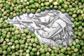
Focus is very good. Depth of field starts to soften at the front of the foreground bagel.

Color appears a bit odd here. Particularly on the bagel to the left. Almost a greenish hue, to my eye.

The seeds are so many, so varied, so scattered, that the bagels come across as the subject instead.

I have to agree the lighting comes across as harsh and cold. The reflection off the left bagel is the reason here. I would recommend a different background also. The background comes off as gray, and unappetizing. A colored cloth or something in earth tones would help.

As is, this picture would not make me want to eat those bagels. Which, if you want the viewer to appreciate and like the picture and the seeds, I feel it should do.

Photographing food is tricky. If it doesn't turn out appealing, then because it is food, people seem to react more strongly in the negative direction.
Photographer found comment helpful.
War & Peas
09/30/2006 11:33:06 AM
War & Peas
by EssAreDubya

Comment by silverscreen:
Very good and very original :)
Close Call
09/29/2006 10:33:05 AM
Close Call
by EssAreDubya

Comment by garlic:
Interesting forms and colors. Well done.
Photographer found comment helpful.
60 Seconds To The Wire
09/28/2006 12:39:27 PM
60 Seconds To The Wire
by EssAreDubya

Comment by cryingdragon:
Greets from the Critique Club

This is a fairly comical photo, however, I think the caption draws away from it. It's quite long and not very Larson-esque. I know this was a Larson tribute, but it seems the shots that recreated one of his works did a lot better than the ones that were tributes to his style.

The rock head seems a bit out of focus around it's mouth area. The James Brown head is quite dark. And there are a lot of reflections in the boy character's face.

It was a good take and the composition is pretty good.

I think it would have scored higher if it was a recreation rather than a tribute shot.

Mike
Pages:   ... [119] [120] [121] [122] [123] [124] [125] ... [142]
Showing 1211 - 1220 of ~1415


Home - Challenges - Community - League - Photos - Cameras - Lenses - Learn - Help - Terms of Use - Privacy - Top ^
DPChallenge, and website content and design, Copyright © 2001-2025 Challenging Technologies, LLC.
All digital photo copyrights belong to the photographers and may not be used without permission.
Current Server Time: 08/05/2025 04:55:43 AM EDT.