| Image |
Comment |
| 12/01/2008 02:40:33 AM |
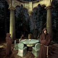
In the Roundby robaComment by dd1989: Wow this is like the front of a movie poster! I love this, top scorer ;) |
 Photographer found comment helpful. Photographer found comment helpful. |
| 12/01/2008 01:35:41 AM |
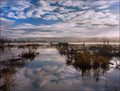
Submergingby robaComment by sulamk: • Composition: like the way the lines of plants lead the eyeinto the scene
• Originality not very original but at least it is not a sunset
• Meets the challenge: n/a
• Wow Factor no
• Technical: good
• Exposure good
• Focus good
• Overall Score: 6 |
| Photographer found comment helpful. |
| 12/01/2008 12:23:25 AM |
|
| Photographer found comment helpful. |
| 12/01/2008 12:19:25 AM |
In the Roundby robaComment by DrAchoo: The gray of the background sky throws me off. It's a neat scene, but I'm working on the purpose. Just sorta wacky like an album cover? or are we to get more out of it? 6 |
| Photographer found comment helpful. |
| 11/16/2008 09:21:44 PM |
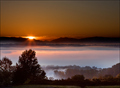
Daybreak by robaComment by posthumous: I gave this a 6. That's a high score for a landscape from me. That's because landscapes rarely hold interest for me. They usually fit so neatly into their genre, and by definition there's no human element to add to it. The reason I gave this a 6 is because it looks upside-down. The clouds are bearing down on the sun, and the fog is so thick it looks like clouds. The trees don't quite fit what the mind is expecting, creating a surprising friction in the brain. The world is neatly divided between land and sky, as in so many landscapes, but this just adds to the disorientation. |
| Photographer found comment helpful. |
| 11/13/2008 09:30:33 PM |
Daybreakby robaComment by yanko: This is a photograph I faved earlier. As I mentioned earlier, the scene looks like two different scenes spliced into one. The top and lower halves if separated could act as complete landscapes in their own right with the fog being the key to completing both images. The scene taken as a whole is quite interesting in its own right. It's not your typical sunrise photo, which often relies heavily on a wider range of colors for it's appeal. This photo doesn't have that nor does it need it.
Technicals, Aesthetics, etc.. ThreadMessage edited by author 2008-11-13 21:31:33. |
| Photographer found comment helpful. |
| 11/13/2008 06:44:59 PM |
|
| Photographer found comment helpful. |
| 11/12/2008 08:07:31 PM |
|
| Photographer found comment helpful. |
| 11/10/2008 05:58:00 PM |
|
| Photographer found comment helpful. |
| 11/09/2008 08:59:12 PM |
Daybreakby robaComment by J-Me: Really STUNNING shot! Well deserved ribbon on it! Congratulations.
I think your crop is really perfect for this shot, btw. :) |
| Photographer found comment helpful. |
Home -
Challenges -
Community -
League -
Photos -
Cameras -
Lenses -
Learn -
Help -
Terms of Use -
Privacy -
Top ^
DPChallenge, and website content and design, Copyright © 2001-2026 Challenging Technologies, LLC.
All digital photo copyrights belong to the photographers and may not be used without permission.
Current Server Time: 07/16/2026 05:52:45 PM EDT.