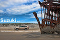
DPChallenge: A Digital Photography Contest You are not logged in. (log in or register
 
Browse Settings
Currently viewing:
Registered Useraliqui

Show comments:

Per page:

Order:

Comments:


Comments Received by aliqui
Pages:   ... [88] [89] [90] [91] [92] [93] [94] ... [175]
Showing 901 - 910 of ~1748
Image Comment
Development
06/15/2009 03:52:59 PM
Development3rd Place
by aliqui

Comment by Melethia:
Amazing detail, perfect light, and yummy Yanko-esque toning. There's a lovely bright feel to this, and nice inclusion of the different stages of the bloom.
Photographer found comment helpful.
Development
06/15/2009 12:08:20 PM
Development3rd Place
by aliqui

Comment by love:
awesome!! 9
Photographer found comment helpful.
Development
06/15/2009 12:30:34 AM
Development3rd Place
by aliqui

Comment by Emerkaza:
This is gorgeous!! My favorite so far. 10
Photographer found comment helpful.
Cartoony/paintingy flower
06/13/2009 09:45:55 PM
Cartoony/paintingy flower
by aliqui

Comment by smichener:
great colors. i wonder how this would work as a square crop?
Photographer found comment helpful.
Cartoony/paintingy flower
06/13/2009 08:39:55 AM
Cartoony/paintingy flower
by aliqui

Comment by sfalice:
Yes, this is delightfully flamboyant.
Photographer found comment helpful.
Peter Iredale
06/07/2009 10:53:59 PM
Peter Iredale
by aliqui

Comment by hotpasta:
great sky...I would have worked a little harder to make the composition more dramatic...a wider lens???
Photographer found comment helpful.
Peter Iredale
06/07/2009 05:24:07 PM
Peter Iredale
by aliqui

Comment by bvy:
The sky seems overworked. Interesting subject matter though.
Photographer found comment helpful.
Suzuki XL7
06/07/2009 03:07:02 PM
Suzuki XL7
by aliqui

Comment by salmiakki:
Greetings from the Critique Club

Congrats on the 6+ score and 20th place.

It was interesting just now reading through the comments, I was amazed how many people didn't get the tagline. I thought it was self evident, but there ya go!

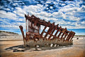
Composition in this image is very strong, although perhaps the shipwreck does over power the car a little. I know it was luck that you managed to get this shot and that it was not a set up, so the car colour was not optional, but that said, I do think a stronger coloured car would have helped. As this was an advanced challenge, I wonder if you could have switched the colour of the car for something else? Just a thought and probably a silly one at that.

It's interesting to watch how the trends come and go on DPC. Currently Topaz Adjust is all the rage and I can see you have used it here. I think used with a bit of discretion this tool can really enhance the processing of some images, but to be perfectly honest, I think it is a little bit too heavy in this image and it has spoilt the quality of the image a bit. I may be the only one thinking like this however, as you did indeed get a decent score.

Like I said, good strong composition, that was hurt a little for me, by a bit of heavy processing.

Photographer found comment helpful.
Peter Iredale
06/07/2009 01:22:10 AM
Peter Iredale
by aliqui

Comment by PiechProductions:
I remember this object from the auto ad challenge! I like the cartoonish feel to this.
Photographer found comment helpful.
Peter Iredale
06/06/2009 03:12:16 PM
Peter Iredale
by aliqui

Comment by HighNooner:
Ooover processed
Photographer found comment helpful.
Pages:   ... [88] [89] [90] [91] [92] [93] [94] ... [175]
Showing 901 - 910 of ~1748


Home - Challenges - Community - League - Photos - Cameras - Lenses - Learn - Help - Terms of Use - Privacy - Top ^
DPChallenge, and website content and design, Copyright © 2001-2025 Challenging Technologies, LLC.
All digital photo copyrights belong to the photographers and may not be used without permission.
Current Server Time: 09/12/2025 07:48:19 PM EDT.