| Image |
Comment |
| 01/21/2008 05:48:55 PM |
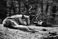
Solitudeby aliquiComment by Ivory: Beautiful animal, I live the sun catching the tips of his fur the way it does, also nice dof. 7 |
 Photographer found comment helpful. Photographer found comment helpful. |
| 01/01/2008 11:04:56 AM |
|
| Photographer found comment helpful. |
| 12/30/2007 08:27:13 AM |
2406.jpgby aliquiComment by Bebe: I actually love this image. Not too heavy-handed for me at all. The colors are beautiful, and it has a very serene feeling.
I agree with the commenter who mentioned the curve on the horizon though - that also bugs me a little. |
| Photographer found comment helpful. |
| 12/30/2007 08:17:33 AM |
2406.jpgby aliquiComment by pawdrix: It looks very over-processed. The D&B is quite blotchy and uneven which immediately draws the eye. I'd say pull it all back. Keep it simple. Message edited by author 2007-12-30 09:48:01. |
| Photographer found comment helpful. |
| 12/30/2007 07:00:26 AM |
2406.jpgby aliquiComment by bassbone: Michelle- I quite like the processing and heavy handed feel of the processing. It seems so remote and forlorn here. I am not sure about the crop on the left - I would like to see the sweep of the rocks all around (dark line seems to be cut off a bit as it comes from the top, down the left and then to the right). The tones really work for me, especially on the sand. The waves on the beach are an outstanding feature of the shot and i almost wish it where emphasized more (a closer crop on that as a second shot). |
| Photographer found comment helpful. |
| 12/30/2007 02:55:00 AM |
2406.jpgby aliquiComment by smardaz: i have not read the other comments but i love how the sky blends right into the sea |
| Photographer found comment helpful. |
| 12/29/2007 11:17:49 PM |
|
| Photographer found comment helpful. |
| 12/28/2007 04:55:28 PM |
boxing.jpgby aliquiComment by macrothing: Does look like the bug is boxing in this and the other image. The top of this image dominates too much and distracts from the little 'scene'. If the quality was there, perhaps a much tighter crop - roughly a third of the way down, to just below the blown white area of the petal, may help. The resulting squareish crop may benefit as well. Tweaking in pp to bring out some more detail may also have helped enhance what you have captured. |
| Photographer found comment helpful. |
| 12/28/2007 04:44:55 PM |
2406.jpgby aliquiComment by macrothing: In response to your request. I'm curious to see the original. If you would share some of your pp would be good too. Also, some insight into your 'vision' for this image; scene, 'feel', colors, etc.
As is, the combination of the curvature of the horizon, the shoreline and the angle/perspective you have taken this image from, makes the image seem off balance, or 'skewed', in a sense. The colors seem a little washed out and, as mentioned below (I don't usually read others' comments before making my own, but did this time), the pp seems to have diminished those colors and, in my opinion, also the textures and detail - which I do wish to see.
Another reason to see the original was to see if perhaps more could be included for added compositional balance.
I like the shape and patterns of the water (seemingly) gently coming in at the foreshore on the right and the other few elements that seem there, but not 'enhanced' (such as the wood/sticks). I wonder what those little things at the edge and in the water are.. Aside from the (tiny) sign visible on the right and the (seeming) footsteps in the sand, looks like quite an untouched scene. |
| Photographer found comment helpful. |
| 12/28/2007 03:04:55 PM |
2406.jpgby aliquiComment by smilebig4me1x: oooh I agree with Tez...this would be a great photo for a strong black and white! I also agree on the dodge/burn..more so on the burning of the white sand down by the water. Its just too much there I think. the yellow sand dodge/burn i think leads my eyes down into the photo along with the sky. my eyes just get stuck on the dark grey area where it meets the water. I think If you fix that it would be perfect (to me at least) hope this helped.
~~Cher~~ |
| Photographer found comment helpful. |
Home -
Challenges -
Community -
League -
Photos -
Cameras -
Lenses -
Learn -
Help -
Terms of Use -
Privacy -
Top ^
DPChallenge, and website content and design, Copyright © 2001-2026 Challenging Technologies, LLC.
All digital photo copyrights belong to the photographers and may not be used without permission.
Current Server Time: 06/27/2026 08:03:33 AM EDT.