A different timeby
aliquiComment by photokariangel: This is Kari Ann, greetings from the
Critique Club:
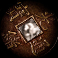
composition: The middle being framed by the incredibly interesting coin adds such feeling and wonder as you stare deeper into the picture, trying to make out what is in the middle
color: the colors are very well played, they resemble that of the old ancient tombs of old, rusting and wearing out under the stifling heat of the sun
contrast: the contrast is beautifully handled in the image, both adding interest, but also helping to blur the center of the image more
focus: very well controlled with such large aperture (serious, what is at 32!?)
depth of field: extremely interesting, as I stated before, I could stare at the middle creamy-ness for hours, imagining what it may or may not be.
lighting: very well managed with so many little crevasses in the coin.
other: I love this. Its so intriguing and interesting. You totally deserved the nomination for a PostLuminous. Heck, i think this could have gone on the first page. I really don't understand the voting on this one, i expected it to be much higher. The only thing I can think of to improve is perhaps changing the middle image to something a little more discernible. Keep entering those challenges, and I hope this comment has helped you some. PM me if you have any more questions.
-Kari Ann