| Image |
Comment |
| 05/12/2006 09:06:48 AM |
|
 Photographer found comment helpful. Photographer found comment helpful. |
| 05/11/2006 09:56:49 PM |
|
| Photographer found comment helpful. |
| 05/11/2006 08:15:40 PM |
|
| Photographer found comment helpful. |
| 05/11/2006 03:38:17 PM |
|
| Photographer found comment helpful. |
| 05/11/2006 01:13:43 PM |
It's a PIECE OF CAKE!by Jaded_HousewifeComment by Aeroglyphics: I really love the sharp contrast between the plate and what it is sitting on. I think it helps to lead the viewers eye towards the cake. I actually voted high on this picture and though it would do much better. Message edited by author 2006-05-11 13:14:13. |
| Photographer found comment helpful. |
| 05/10/2006 11:55:29 PM |
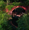
bridge over dirty waterby Jaded_HousewifeComment by Neuferland: Greetings from the Critique Club!
My first impression is, "WOW! What a pretty picture!" Then I read the title and laughed out loud! ;) I don't see the dirty water myself, I see a very nice reflection in the water of the bridge giving a very nice mirror effect.
What also grabbed my attention right off though was the red bar in the upper left side. It wants to lead me in or out or I'm not really sure how to feel about that bar, it's confusing me honestly. It's a nice directional line against the arch but at the same time it's competing for the attention, does that make sense. When I scroll my screen up just enough to remove the bar it really changes the entire composition of the shot. No more competition for my attention, it's all on the arch and what's inside of it.
And what is inside of that arch? The vision here is stunning to me, I love it. It looks like an arch to another world, almost a mirror world again. The reflection on the water, the bricks that are in the water, the plants on the other side, it's all creating a very visual meal for my eyes. I just can't seem to get enough! Well done overall!
Hope my comments help and good luck in future challenges!
Deannda |
| Photographer found comment helpful. |
| 05/10/2006 11:09:19 PM |
|
| Photographer found comment helpful. |
| 05/10/2006 04:45:28 PM |
odyssey-b@w-2.jpgby Jaded_HousewifeComment by saracat: I like the pose here. It's very introspective for one so young, and it gives her almost a 'not here' feel - like she's in her own little world and having fun with it.
What I can see that could possibly use some improvement would be that her dress is almost overexposed, yet her face is very underexposed, which makes it hard to see clearly. The dress is so bright that it is trying to become the 'focus' of the shot. Perhaps shooting when the light is not so harsh (or carrying a large diffuser or pop-up shade with you) would help with the differences in exposure, or try to photograph her when she is wearing clothing that more closely matches her skin tones.
I know this is a 'spur-of-the-moment' capture (kids can be sooo difficult to work with! :) I know - I have a couple of my own.), so I completely understand that you have to work with what you have. |
| Photographer found comment helpful. |
| 05/10/2006 10:44:31 AM |
|
| Photographer found comment helpful. |
| 05/10/2006 10:28:40 AM |
|
| Photographer found comment helpful. |
Home -
Challenges -
Community -
League -
Photos -
Cameras -
Lenses -
Learn -
Help -
Terms of Use -
Privacy -
Top ^
DPChallenge, and website content and design, Copyright © 2001-2026 Challenging Technologies, LLC.
All digital photo copyrights belong to the photographers and may not be used without permission.
Current Server Time: 07/27/2026 06:02:48 PM EDT.