| Image |
Comment |
| 04/30/2007 03:33:08 AM |
|
 Photographer found comment helpful. Photographer found comment helpful. |
| 04/30/2007 01:05:42 AM |
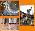
Walking in Romeby Rino63Comment by smardaz: really pretty tho the statue seems a little oof and the fact that only the bottom one has a white frame is distracting /6 |
| Photographer found comment helpful. |
| 04/30/2007 12:50:25 AM |
|
| Photographer found comment helpful. |
| 04/30/2007 12:16:10 AM |
Preparing a desperate saladby Rino63Comment by Nuzzer: Hi from the Critique Club.
Fit: The shot contains kitchenware so it is a fit for the challenge. I wonder if some voters saw the food as DNMC elements?
Composition: The composition seems ok. We have string lines all leading to the one point. The decorations on the plate do seem to detract from these lines a bit.
Technical: As the commenters have noted, the oversaturation is a bit hard on the eyes! It is a good look in some ways but once we look at the image we find that the oversaturation is not really a key element in the image. The knife and fork seem to be the major elements so the colours seem to be a negative element.
Feel: I like the strong colours and grany feel the image has but the shot as a whole seems to be lacking a string message for me...what is the shot trying to say to me? Not even the title really helps me feel your intent.
PM me if you have any queries |
| Photographer found comment helpful. |
| 04/29/2007 06:59:34 AM |
|
| Photographer found comment helpful. |
| 04/25/2007 11:23:21 PM |
Sunset reflectionsby Rino63Comment by dr rick: Greetings from the Critique Club.
The first thing I noticed with this photo were the bright, saturated colors. They really catch the eye! Unfortunately, the expectation of a nice abstract (or perhaps surreal) photo isn't fulfulled. After the initial "wow", the subject is recognized and the colors just look unrealistic and oversaturated.
The photo is, paradoxically, both overexposed and too dark. There's just a really high dynamic range here that is very difficult to capture without special techniques.
The composition is great left-to-right. The boats are attractive and the placement of the elements gives a great impression of depth. But top-to-bottom the composition isn't well balanced. The centered horizon that's bright above and dark below just doesn't work for me, although the masts do their best to tie the photo together. I think cropping about a sixth from the top helps a lot. And perhaps a bit less from the bottom to give a panoramic format would suit this photo well.
But getting back to the original idea (or at least my original impression), I think this photo could work by taking a surreal approach: selectively darken the sky and mountains to give a sort of low key effect. Although the bright areas would still be bright, and there's far too much contrast for a true low key photo, I think the effect could be dramatic, and the "unreality" subtle enough to give the viewer the feeling of "something isn't quite right, but this sure is pretty." |
| Photographer found comment helpful. |
| 04/25/2007 04:46:14 PM |
|
| Photographer found comment helpful. |
| 04/25/2007 08:19:49 AM |
|
| Photographer found comment helpful. |
| 04/24/2007 11:42:13 PM |
Dramatic framingby Rino63Comment by dr rick: Greetings from the Critique Club.
This is a wonderful minimalist photo. Most everything except the shape of the bicycle is stripped away, making the subject very clear. It's a very dramatic treatment, as was intended. The cobblestones make a great texture with the high contrast; a whole lot more interesting than a smooth road would be.
The composition is great. It's nicely balanced and really draws the viewer into the scene. The front hub is right on a rule-of-thirds intersection, and lots of lines point to it, making it the clear focal point. Cutting off the top of the rider intensifies the focus on the bicycle. Cutting off parts of the back wheel is unusual, and it works very well.
I am bothered by the "missing" spokes. It really isn't that distracting, and the subject is still clear. It just seems a bit strange to see some spokes but not all of them.
But overall a great photo. I've really enjoyed studying it. |
| Photographer found comment helpful. |
| 04/24/2007 10:50:18 PM |
|
| Photographer found comment helpful. |
Home -
Challenges -
Community -
League -
Photos -
Cameras -
Lenses -
Learn -
Help -
Terms of Use -
Privacy -
Top ^
DPChallenge, and website content and design, Copyright © 2001-2026 Challenging Technologies, LLC.
All digital photo copyrights belong to the photographers and may not be used without permission.
Current Server Time: 06/25/2026 01:02:07 PM EDT.