| Author | Thread |
|
|
05/07/2007 12:48:41 PM |
Greetings from the Critique Club
Challenge: Meets the challenge, no problems there.
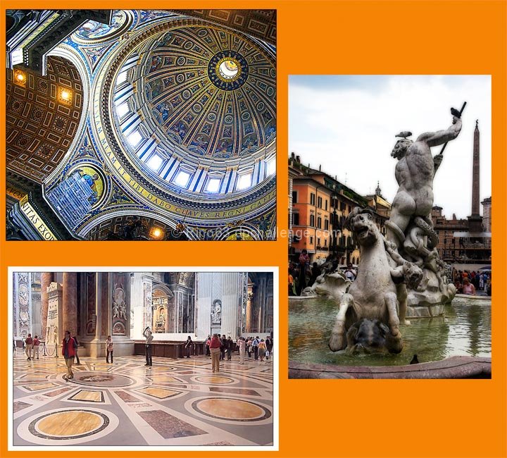
Strong points: Great architecture, beautiful shots of it. The colours in the individual images, especially the two indoor shots, are spectacular, as is the detail in those two shots.
Possible weaknesses: Mainly the presentation. There seems to be a disconnect between the grandeur of the images, and your presentation of them as a group. The orange is a bit on the strong side, the extra white border around the bottom image gives a sense of disconnect, the different treatment for the individual images increases this sense of disconnect.
Technicals: The two indoor shots look to have no technical problems. The light in the shot to the right is more difficult to control.
Overall: I think that what you mainly have here is three beautiful shots that, even though they belong together, are not working together as a unit. They are beautiful by themselves, but put together it is too much. The presentation increases this sense of the images being individual shots rather than a unit or a story.
I hope this helps. If I can be of further help, please let me know.
~Ursula |
|
 Photographer found comment helpful. Photographer found comment helpful. |
Comments Made During the Challenge  |
|
|
05/06/2007 01:54:57 PM |
|
orange? and so much of it! no real design to the layout either - too bad because the photos themselves are very nice |
|
| Photographer found comment helpful. |
|
|
05/06/2007 04:48:44 AM |
|
Very cool, the top left image is spectacular. |
|
| Photographer found comment helpful. |
|
|
05/04/2007 07:38:40 PM |
|
I can see the orange in the photos, but it's competing for attention - it too bright. |
|
| Photographer found comment helpful. |
|
|
05/04/2007 06:11:34 PM |
|
wow! i love the picture on the right! |
|
| Photographer found comment helpful. |
|
|
05/04/2007 04:28:15 PM |
|
ah Rome... brings me back a ways... The shots are great, particularly the top left, i just wish you chose a different color for the backdrop... |
|
| Photographer found comment helpful. |
|
|
05/04/2007 11:24:28 AM |
|
Not keen on the orange border - but great shots. |
|
| Photographer found comment helpful. |
|
|
05/04/2007 12:33:29 AM |
|
The back ground color is very bold but is OK. The white border seems out of place as it is the only one with a border. |
|
| Photographer found comment helpful. |
|
|
05/03/2007 08:11:34 PM |
|
The Background is terrible and there needs to be some kind of consistency in the setup. |
|
| Photographer found comment helpful. |
|
|
05/02/2007 02:54:06 PM |
|
Nice triptych and photography but I think the background color is a little over powering. |
|
| Photographer found comment helpful. |
|
|
05/02/2007 09:32:36 AM |
|
Nice layout and I really like the two shots on the left, but the one on the right is hard to look at -- overall focus is soft and eye can't tell whether to focus on the statue or the buldings in the background. I would have used a softer background color as well. |
|
| Photographer found comment helpful. |
|
|
05/01/2007 11:58:57 PM |
|
individually, the three different shots would be very strong, but as a trypich I'm not sure they're working. they seem to all have different effects applied to them, the shot of the ceiling being the strongest, and the shot of the fountain having some soft-focus effect applied. also, they seem to be rather haphazardly placed on the page, with different framing elements, although I rather like the orange. a bit more consistencey and I think this would be much stronger. |
|
| Photographer found comment helpful. |
|
|
05/01/2007 07:56:33 PM |
|
oh! che bella'Roma!! Mi piacono tanto! |
|
| Photographer found comment helpful. |
|
|
05/01/2007 05:18:10 PM |
|
not a fan of the orange border, but the shots are nice! |
|
| Photographer found comment helpful. |
|
|
05/01/2007 12:51:09 AM |
|
Great set - But the orange is too distracting. |
|
| Photographer found comment helpful. |
|
|
04/30/2007 09:16:15 PM |
|
| Photographer found comment helpful. |
|
|
04/30/2007 08:30:47 PM |
|
I really like your photos but I don't like the way you have presented them. The orange does nothing for the photos, it is too garish and does not complement the beautiful, historic architecture you have captured. You have a white border around only one of the images, this creates an imbalance. |
|
| Photographer found comment helpful. |
|
|
04/30/2007 08:10:38 PM |
|
Interior shots are just wonderful. On my screen that exterior statue shot looks a bit fuzzy. But still, it's a nice grouping. |
|
| Photographer found comment helpful. |
|
|
04/30/2007 03:36:31 PM |
|
| Photographer found comment helpful. |
|
|
04/30/2007 03:22:01 PM |
|
nice shots, but why does only one have a white border? |
|
| Photographer found comment helpful. |
|
|
04/30/2007 01:25:29 PM |
|
Some beautiful images, but I find the color almost too bright. Also, why only put a white border around the 1 image? |
|
| Photographer found comment helpful. |
|
|
04/30/2007 09:55:43 AM |
|
Great pictures. Not sure about the arrangement or the background color. |
|
| Photographer found comment helpful. |
|
|
04/30/2007 03:33:08 AM |
|
its a piity you didnt put a white border on all of them |
|
| Photographer found comment helpful. |
|
|
04/30/2007 01:05:42 AM |
|
really pretty tho the statue seems a little oof and the fact that only the bottom one has a white frame is distracting /6 |
|
| Photographer found comment helpful. |
|
|
04/30/2007 12:50:25 AM |
|
I cant say Im fond of the orange but I like everything else! |
|
| Photographer found comment helpful. |
Home -
Challenges -
Community -
League -
Photos -
Cameras -
Lenses -
Learn -
Help -
Terms of Use -
Privacy -
Top ^
DPChallenge, and website content and design, Copyright © 2001-2026 Challenging Technologies, LLC.
All digital photo copyrights belong to the photographers and may not be used without permission.
Current Server Time: 06/29/2026 02:34:11 AM EDT.