| Image |
Comment |
| 06/13/2006 12:52:56 AM |
|
 Photographer found comment helpful. Photographer found comment helpful. |
| 06/12/2006 10:10:53 PM |
|
| Photographer found comment helpful. |
| 06/12/2006 09:27:56 PM |
|
| Photographer found comment helpful. |
| 06/12/2006 05:52:59 PM |
|
| 06/12/2006 01:23:57 PM |
|
| 06/12/2006 09:15:57 AM |
|
| 06/12/2006 09:09:01 AM |
|
| 06/12/2006 04:43:12 AM |
Flirtby RebeccaComment by Rankles: I'm bumping this higher due to the lack of originality in 80% of the photos. A simple but brilliant take on the challenge. |
| 06/12/2006 02:45:30 AM |
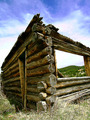
Humble Homesteadby RebeccaComment by yanko: Greetings from CTP2
The first thing that strikes me about this is it's sharpness. I think I got a splinter just looking at that detail. :P Speaking of which, you might want to revisit this place for the next texture challenge.
The composition is a little odd to me. Maybe if both sides of the structure ran off into a vanishing point like the left side it would have worked better, IMO. Regardless, I like how you tried to be different here. I would also say rotate the image a bit since the building looks like it's leaning but that actually enhancing the fragile aspect to this.
As far as the sky is concern, it didn't really bother me at first until I read some of those other comments you received. The color does look fake looking but more than that it just looks out of place in an otherwise traditional looking photograph. The color on the building looks good however.
Overall a good image. I like the direction you were going here. Even though I saw a few others like this in this challenge I thought this whole concept of old architecture to be out of the box great thinking so congrats on that front. |
| Photographer found comment helpful. |
| 06/11/2006 06:52:28 AM |
|
Home -
Challenges -
Community -
League -
Photos -
Cameras -
Lenses -
Learn -
Help -
Terms of Use -
Privacy -
Top ^
DPChallenge, and website content and design, Copyright © 2001-2026 Challenging Technologies, LLC.
All digital photo copyrights belong to the photographers and may not be used without permission.
Current Server Time: 06/25/2026 12:48:46 PM EDT.