| Author | Thread |
|
|
06/20/2006 12:46:42 PM |
Hi!
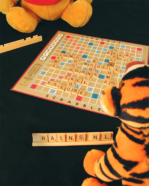
The background and lighting are better, I would like to see pooh and Tigger's faces. It is sn improvement though:) |
|
 Photographer found comment helpful. Photographer found comment helpful. |
|
|
06/15/2006 09:32:06 AM |
CTCP2 Gunnsi
First impression:
Much better image. More quality, good focus, better viewing angle and without that noise you added the last time.
What can you do better?
I would have liked to see Winnie's face. You also should have told about in wich challenge the original was. Usually children toys do not score high, but a retake from a toy challenge is another thing. |
|
| Photographer found comment helpful. |
|
|
06/14/2006 11:07:39 PM |
hi from ctp2:
Hey, you improved! I like the black background a lot better, and the angle works well. I like the way you can see a bit of pooh's face in the first one, though. Cute picture! |
|
| Photographer found comment helpful. |
|
|
06/13/2006 02:26:19 PM |
Greetings from your own critique club. Sorry, I was off the hook for a while.
First Impression
Very Nice shot. Much better than the original one. Good improvement and that was the idea of the challenge.
Composition:
Better Composition than the original. I would like to see more of Pooh.
Subject:
Subject may not be of interest to many voters IMO. That may be one reason for low score. But this challenge had different purpose. You are at disadvantage as voters don't really recall the original to compare the improvement.
Technical (Colour and light):
Very nice. Really like the Black BG.
Improvement:
Different agnle to include more of Pooh.
Summary:
Over all lots of improvement compare to take I.
Cheers!! Keep shooting. |
|
| Photographer found comment helpful. |
Comments Made During the Challenge  |
|
|
06/12/2006 09:27:56 PM |
|
| Photographer found comment helpful. |
|
|
06/10/2006 07:41:11 PM |
|
Hahahaha...very clever...must've taken a while for that setup. |
|
| Photographer found comment helpful. |
|
|
06/08/2006 12:23:10 AM |
|
points for creativity........ |
|
| Photographer found comment helpful. |
|
|
06/07/2006 07:48:33 AM |
|
| Photographer found comment helpful. |
|
|
06/06/2006 04:25:28 PM |
|
lol, great idea!! brought a smile to my face as soon as i saw it :) Great shot |
|
| Photographer found comment helpful. |
|
|
06/06/2006 10:37:35 AM |
|
love the effort on the setup. great title too :) |
|
| Photographer found comment helpful. |
|
|
06/06/2006 01:16:17 AM |
|
This is very, very cool! Such a touching shot! Your crativity is wonderful! 10 |
|
| Photographer found comment helpful. |
Home -
Challenges -
Community -
League -
Photos -
Cameras -
Lenses -
Learn -
Help -
Terms of Use -
Privacy -
Top ^
DPChallenge, and website content and design, Copyright © 2001-2026 Challenging Technologies, LLC.
All digital photo copyrights belong to the photographers and may not be used without permission.
Current Server Time: 06/30/2026 12:32:31 AM EDT.