| Image |
Comment |
| 02/10/2003 05:22:44 PM |
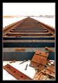
End of the Lineby DavenitComment by jmsetzler: excellent perspective shot... the deep depth of field works very well here also... the symmetry of the tracks and the clutter in the bottom of the frame offset each other nicely... great shot :) - setzler |
 Photographer found comment helpful. Photographer found comment helpful. |
| 02/10/2003 12:40:05 PM |
End of the Lineby DavenitComment by jodiecoston: The colors are excellent and the bolts laying about really add something 'different' to the shot of tracks that we see so often. Nice work. 8 |
| Photographer found comment helpful. |
| 02/03/2003 07:59:00 PM |
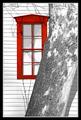
Shades Drawn...by DavenitComment by indigo997: Sorry for the random stream-of-consciousness type critique, but here it is.
Why does this photo make me uneasy? I really like the bold red and the shadows along the top. You did a good job of putting the pieces together. The "hole" in the tree at the top right corner is a bit weird. Even if that's how the real tree is, I think it woulda been better to have it solid in this shot. I also like the reflection. You obviously did quite a bit of work on this. IMO, it sort of gets away from the whole idea of a photography challenge and enters into digital art, but it was legal in this case. The black border works well. The lighting is just so bright - it's uniform on all the objects, but it makes the photo so stark and cold.
This reminds me of the new digital cartoons that look so realistic and sort of mess with your perception of reality. I like the diagonal of the tree and how its texture contrasts with the uniformity of the siding on the house.
Overall, it's an interesting shot that was well received for good reason. You obviously know your editing software. |
| 02/03/2003 06:57:31 PM |
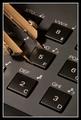
All Sides Equal...by DavenitComment by jmsetzler: Greetings from the Critique Club :)
Hi Dave...
Technically, this is a very good shot. I don't know what kind of lens you used, but whatever it is worked well. F27 seems a bit drastic :) I believe you were going for strong depth of field, which you achieved.
I believe the 'sharpness' could be a little stronger in this image. Maybe a quick pass with the photoshop sharpen filter?
The color of the light reflecting off the metallic surface is also picking up a yellow glow from your light source. A little desaturation on the yellow/red channels may have brightened this up a little also :)
The image is very strong technically... that is good work for sure. Subjectively, I think it's a little weaker maybe. In the past, I have always strived for technical perfection in my images also. I am in a stage now where I'm trying to integrate technical excellence with subjective 'wow' factor at the same time...
Keep up the good work!
John Setzler
|
| 02/02/2003 10:38:05 PM |
Shades Drawn...by DavenitComment by David Ey: Must be lots of folks like this kind of photo with objects in front of the subject.
Actually, with the shadows of the small branches at the top, the trunk 'fixes' this photo for me. Your viewing angle is just right too by cutting off the lower right of the window the perfect amount. After looking closer, I like it a lot. |
| 02/02/2003 10:33:19 PM |
|
| 02/02/2003 09:22:55 PM |
|
| 02/02/2003 08:04:55 PM |
|
| 02/02/2003 08:55:37 AM |
|
| 02/01/2003 02:49:32 PM |
All Sides Equal...by DavenitComment by Azrifel: The use of the compass makes this an original image (and it adds color without breaking the balance), the combination of angles is very good.
Good lighting, nice frame. |
Home -
Challenges -
Community -
League -
Photos -
Cameras -
Lenses -
Learn -
Help -
Terms of Use -
Privacy -
Top ^
DPChallenge, and website content and design, Copyright © 2001-2026 Challenging Technologies, LLC.
All digital photo copyrights belong to the photographers and may not be used without permission.
Current Server Time: 07/16/2026 04:58:38 AM EDT.